Kvarter
Curated boutiques around you, at your door.
Local commerce & Delivery
Project Information
Every city has a hidden layer. The ceramics studio three streets over. The natural wine shop with no online presence. The vintage outerwear archive that does not deliver. These places define a city's character and are almost impossible to access on demand. Kvarter is the infrastructure that changes that.
Independent boutiques do not fail because their product is wrong. They fail because the logistics of modern retail, delivery, visibility, and digital presence, were built for scale, not for craft. Meanwhile, shoppers who care about provenance and curation are stuck choosing between convenience and quality.
That gap is the product.

Intent before interface
User goals, core interactions, and system structure came first. The visual layer only worked because the underlying product logic was clear.
1. User intent

Discovery, need, and immediacy
The first question was not what the interface should look like, but what people were trying to get done. Kvarter had to support browsing with taste, finding something nearby, and acting quickly once intent became specific. That meant understanding the difference between open-ended discovery, practical need, and local convenience, then designing for each without fragmenting the product into disconnected journeys.
2. Core interactions

Where the service wins or fails
The service lives or dies on the handoff between discovery, reservation, and delivery. These flows had to feel immediate, reduce hesitation, and make the next action obvious for shoppers, stores, and drivers alike. The core interaction model had to stay simple under pressure: clear entry points, strong defaults, visible status, and transitions that keep momentum instead of forcing people to stop and re-evaluate what the system expects from them.
3. Information architecture

One app, several ways in
Before polishing UI, the product needed a structure that could hold different shopping mindsets without fragmenting into disconnected flows. The architecture established what belonged where, what stayed shared, and how discovery, product browsing, and quick decision-making could coexist inside one app. That structure became the backbone for navigation, component logic, and system language, making it possible to grow the experience while keeping it legible at every step.
Designing the Kvarter app
The user app had to make independent retail feel immediate, desirable, and easy to act on, without flattening every boutique into the same generic shopping experience.

The first screen sets the contract
The first thing you see after downloading Kvarter is not a wall of utility. It is a retail surface. Products lead. Editorial framing leads. The app opens by telling users what kind of place they have entered: curated, selective, and rooted in the character of real boutiques rather than warehouse logic.
That matters because the first screen establishes trust. If Kvarter looked like a generic delivery app, the entire proposition would collapse. The opening experience had to signal taste immediately, while still feeling like the beginning of a fast, usable shopping journey.
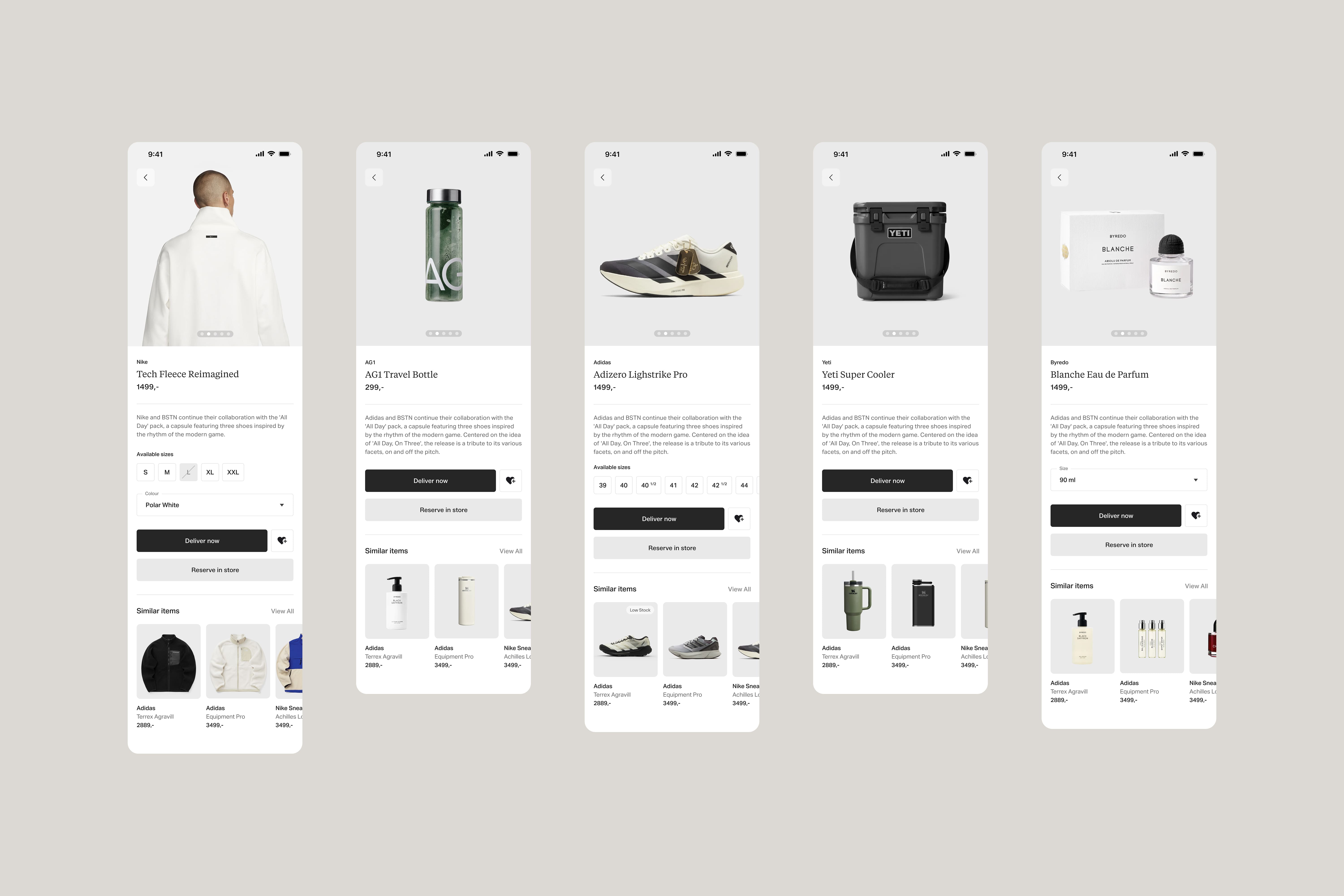
Product pages that adapt to the object
One of the core design challenges was versatility at the product level. Fashion, interiors, ceramics, books, and specialty goods do not want the same framing. The product page system had to flex across very different shapes, textures, scales, and buying cues, while still feeling unmistakably part of the same app.
That is where the interface does real retail work. Typography, spacing, image scale, and information hierarchy were tuned to make each product type shine on its own terms rather than forcing everything through one template. The goal was not sameness. It was controlled variation.
To support that, boutiques also have access to an AI-based image generator in their own app that takes whatever product photography they have and places it onto a neutral background. That gives the user-facing experience consistency where it needs consistency, while still letting the products keep their distinct character.

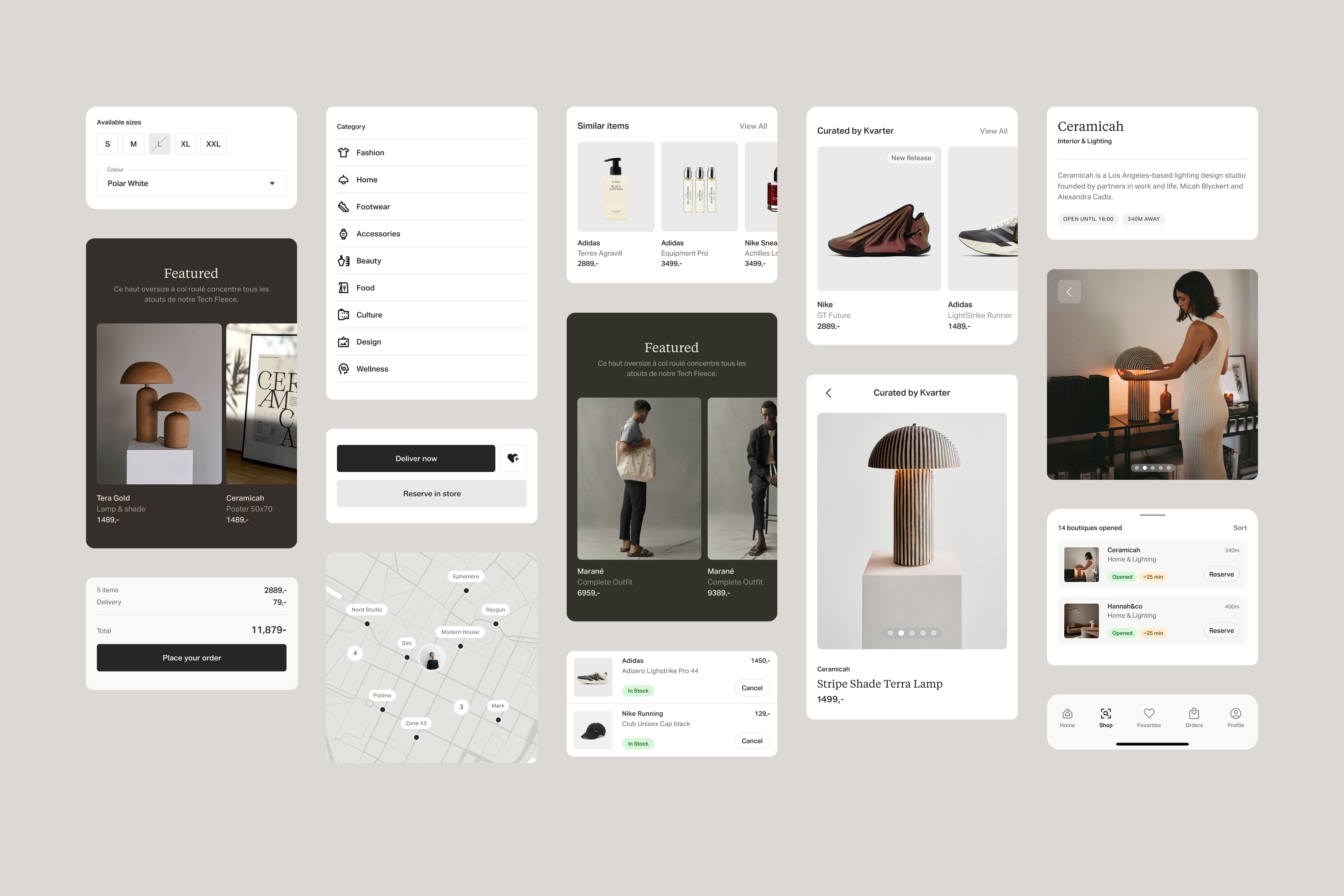
Editorial can be tuned, not bolted on
The Featured by Kvarter layer shows how editorial can live inside the product without becoming decorative noise. Color becomes part of the storytelling surface, helping collections, boutiques, and moments feel distinct without breaking the system.
That flexibility is shared. Both the editorial team and boutiques can tune colors to enrich identity and give different parts of the app their own atmosphere. The result is a platform that feels alive and curated, while still operating inside a disciplined interface language.

The map makes availability legible
The explore map is where the app becomes immediately useful. It gives users fast access to open stores by category, turning location and availability into something glanceable rather than something they have to investigate store by store.
The interface had to stay sleek here because the map is functional, but still part of the same premium retail experience. It is not a utility detour. It is another expression of the same product, one that shifts from browsing mood to immediate orientation without losing composure.
A design system with range
Underneath the surfaces sits a design system built to carry both editorial presence and premium utility. Cards, buttons, menus, product tiles, states, and navigation all had to feel refined enough for high-end retail, but robust enough to support everyday shopping behavior without friction.
The system works because it is not trying to split those goals apart. It treats curation and usability as the same job. Every component is tuned to support both mood and action, which is what allows the app to stay elegant without becoming precious.
One app, every shopping state
Boutique, product, explore, fitting room, and order all needed their own register, while still feeling like one coherent experience from desire to decision.
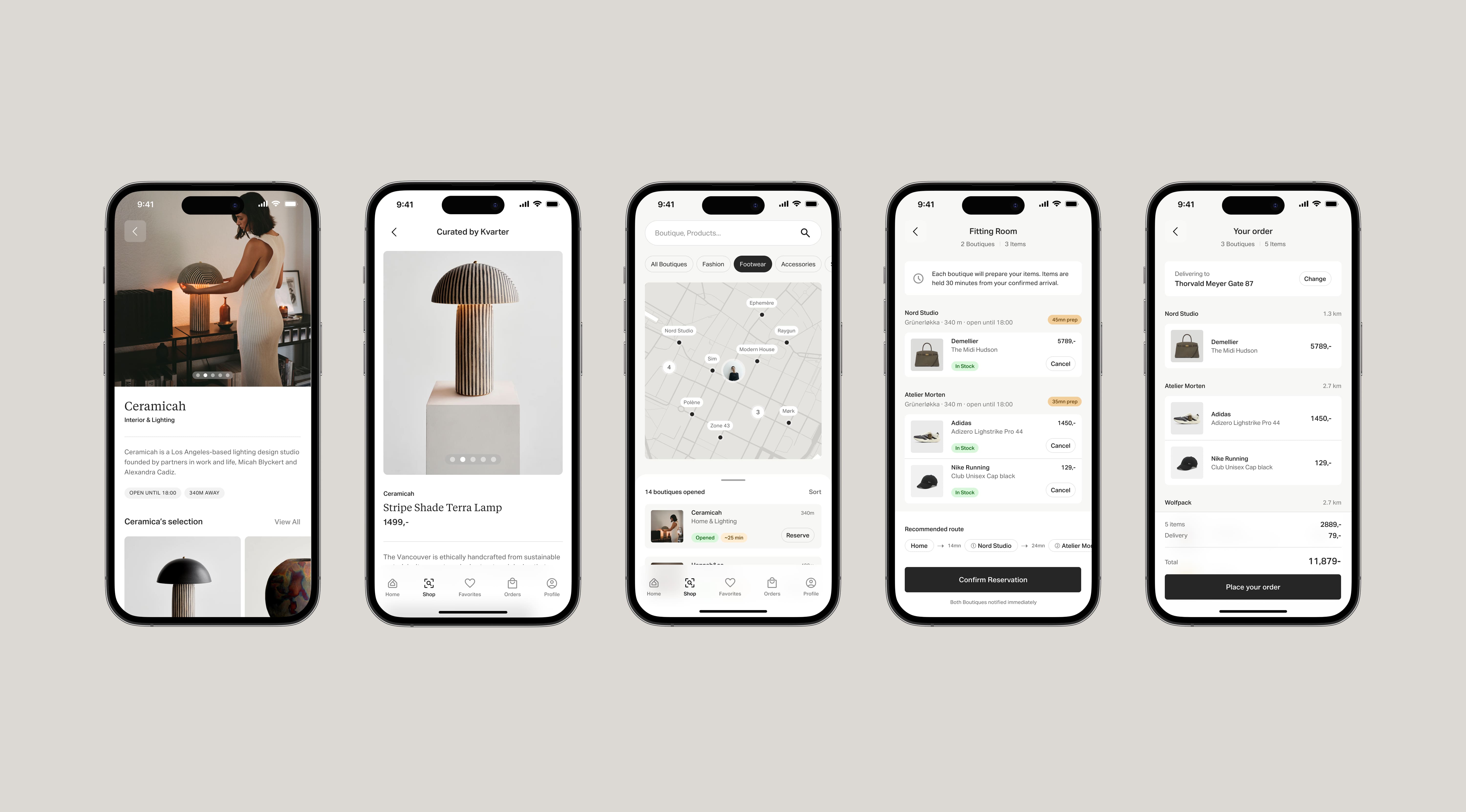
Versatility without fragmentation
The final test of the app is whether all of these moments can coexist without feeling stitched together. A boutique page needs atmosphere. A product page needs focus. The explore map needs orientation. The fitting room needs confidence. The order page needs calm. Each one serves a different psychological state, but none of them can feel like they belong to a different product.
Kvarter works because the interface keeps the same center of gravity throughout. It can be editorial without becoming vague, and operational without becoming cold. That is what makes the app feel credible as both a high-end retail destination and a tool people can rely on when they want something now.
That balance is the real ambition of the case study. Not simply making local commerce look beautiful, but giving it a product language strong enough to hold taste, speed, trust, and decision-making inside one coherent app.

Need senior hands on the work? Book a call and let's discuss the brief.