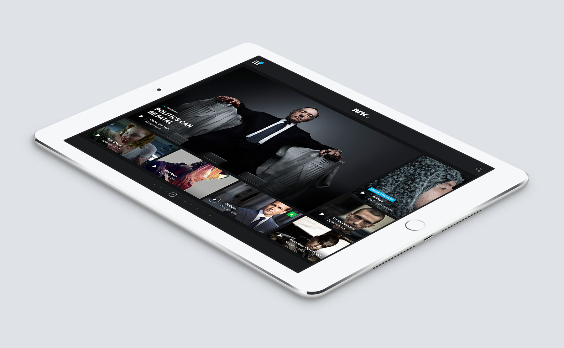
During my employment at Bleed, I joined the norwegian public broadcasting company’s new media team as an in-house digital design & user experience consultant to build a brand new application, both for tablets and mobile phones. In collaboration with the NRK Team, I laid out the experience principles, navigation concepts and visual design of the app.
AN OCEAN OF CONTENT
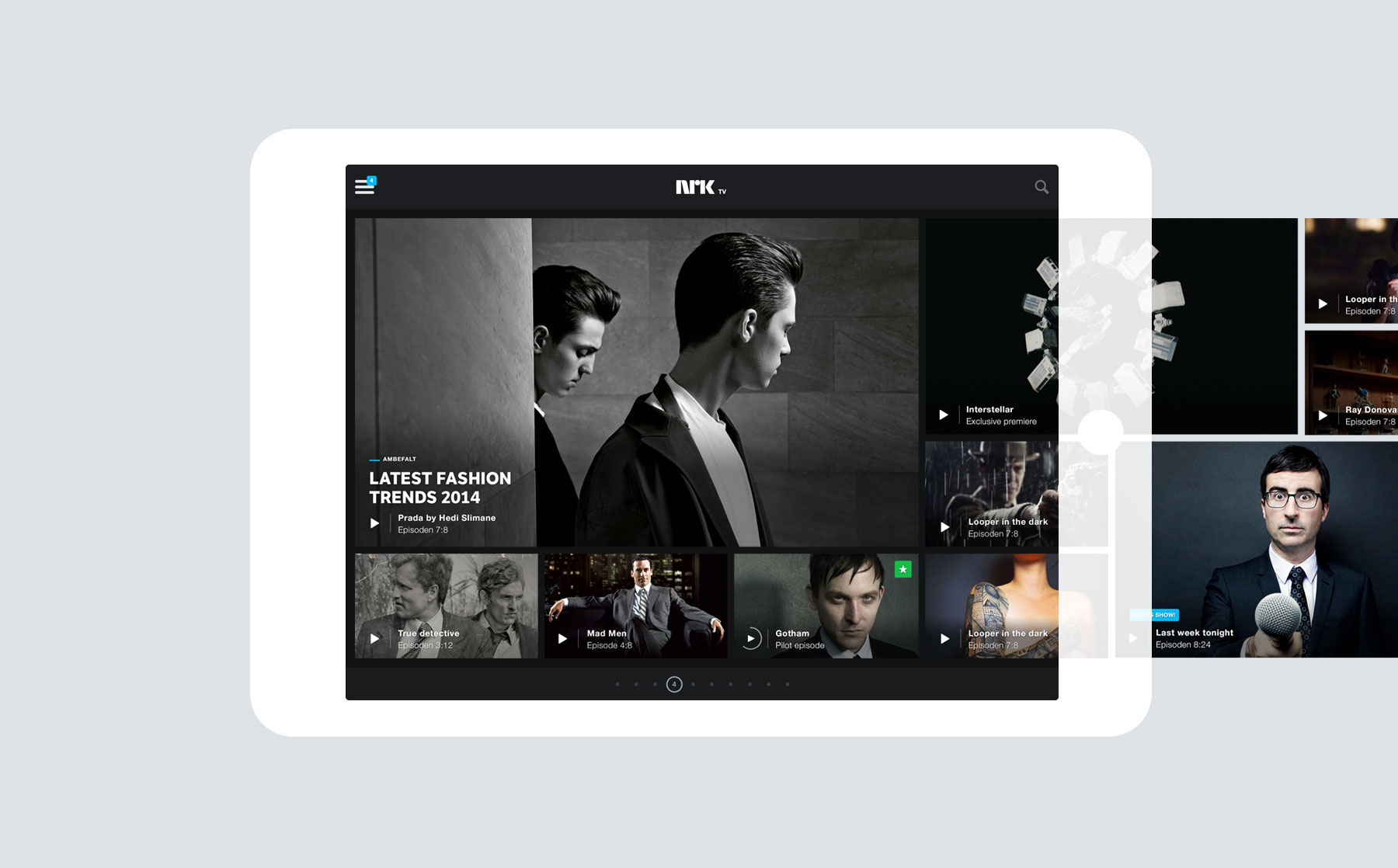
NRK is a major provider of quality content in Norway, and it was mandatory that they were perceived as such. I created an “Ocean of content” concept for the app, that we developed for a few weeks. Offering content curated by the editorial team, but also personalised accordingly to what you have watched previously, the app is an intelligent companion for discovering great TV Programs.
ALWAYS SOMETHING ON
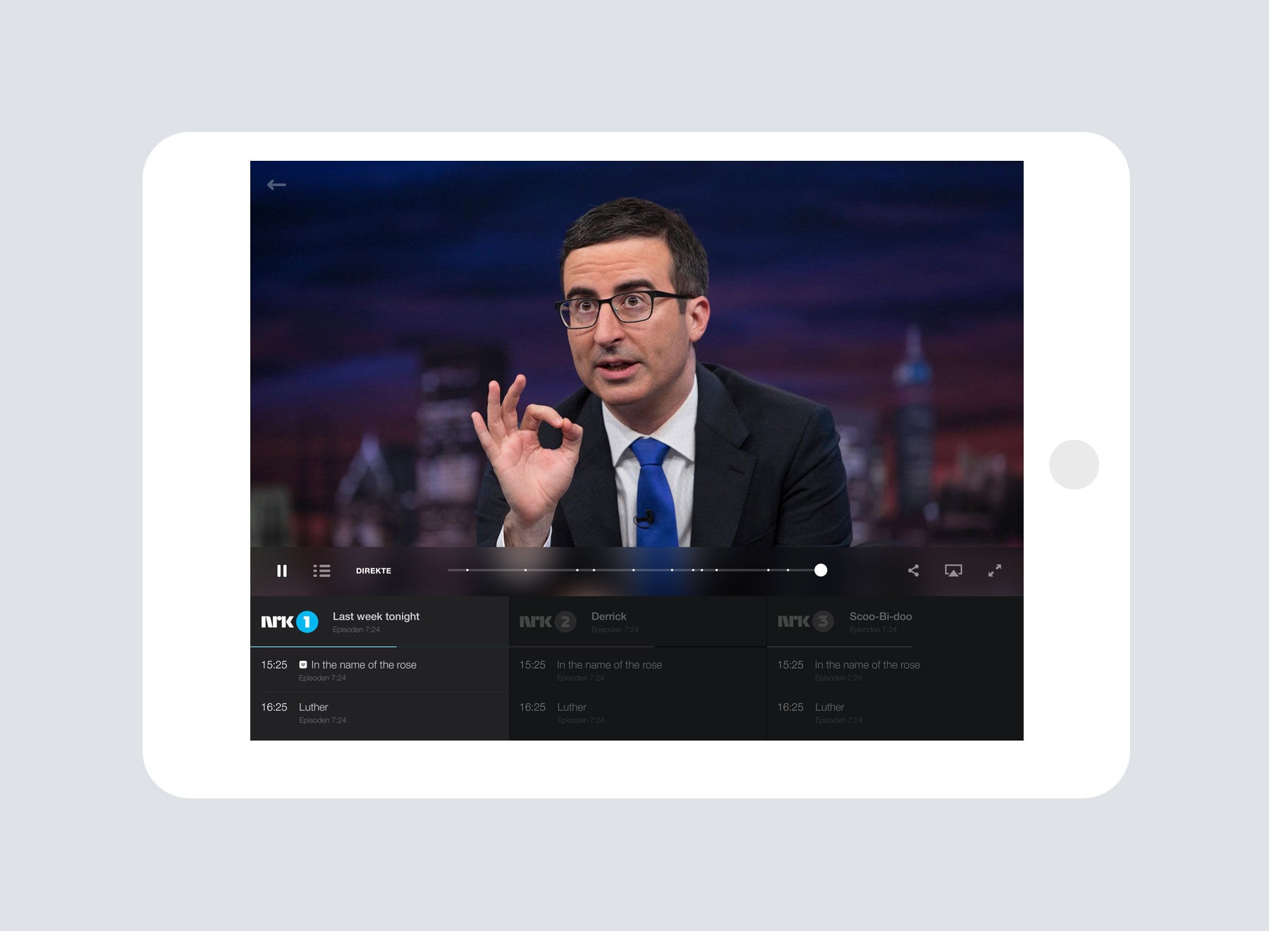
While the competition keeps its content structured as a directory, I wanted to go back to a television entertainment experience. If you don’t know what to watch, opening the app is enough for you to find something interesting, always. You’re not browsing through channels, you’re offered all the content NRK can offer, in one simple page. If you’re looking for something specific, categorising the content is possible with one tap.
INTELLIGENT INTERACTIONS
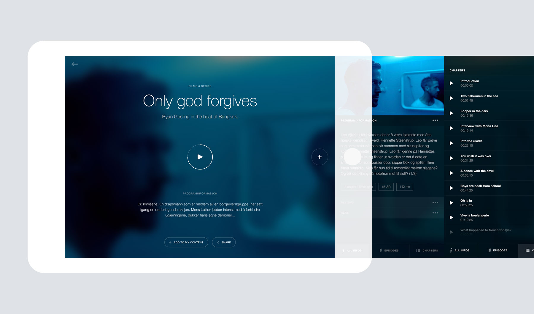
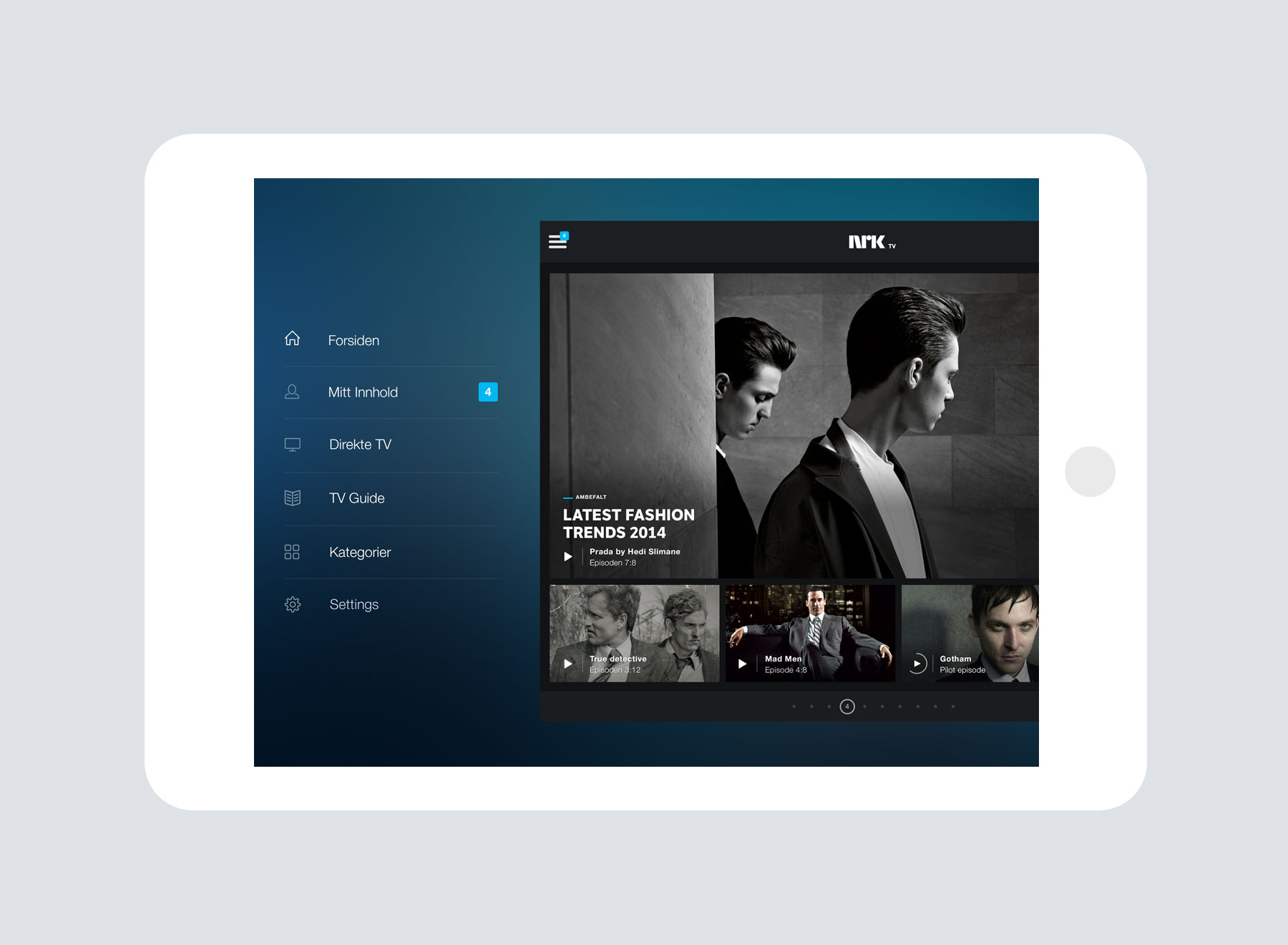
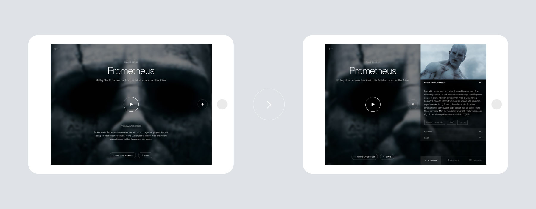
Click the play button to open the player full-screen, anywhere else on the item to open its detailed page. From there, simply swipe left and you’ll open the one drawer containing everything: Other episodes, seasons, reviews, cast information… The app was conceived to be the simplest possible to interact with, without undermining the quality of the experience. Oh, you can also tap & hold anywhere to have access to a contextual menu, allowing you to do virtually anything with a program.
"NRK crushes the competition with their app"PER KRISTIAN BJØRKENG — AFTENPOSTEN
"Have you first tried NRK new app for mobile and tablet, you're hooked. Less than a year after launching, the app was downloaded over a million times. Both journalists and consumers are excited."TOM TANDE — GRAFILL

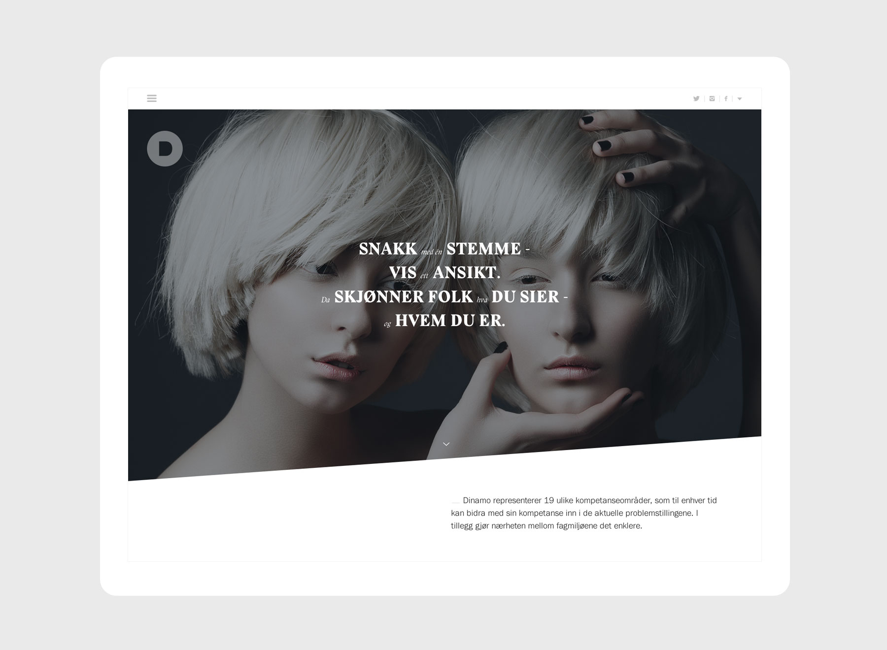
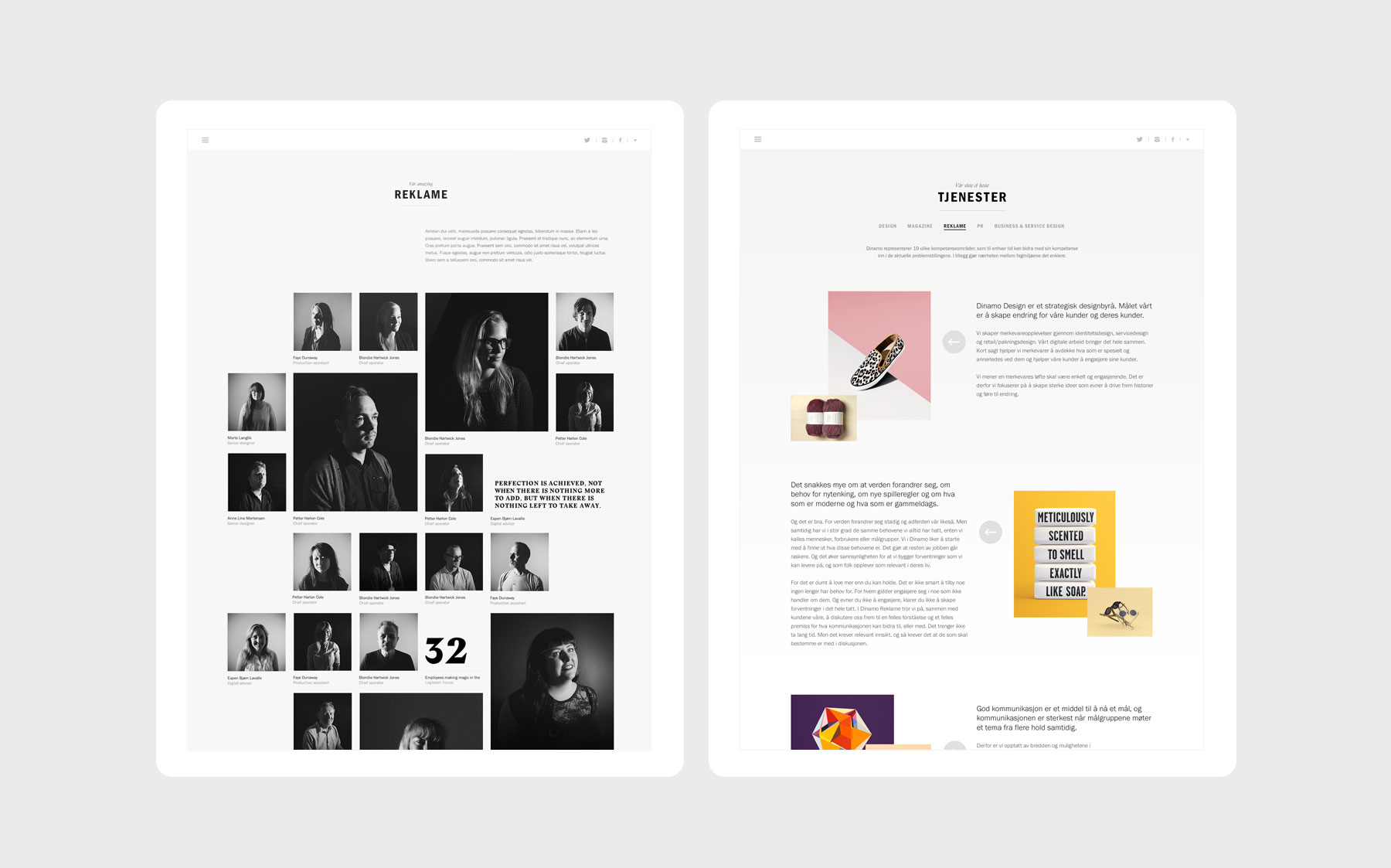
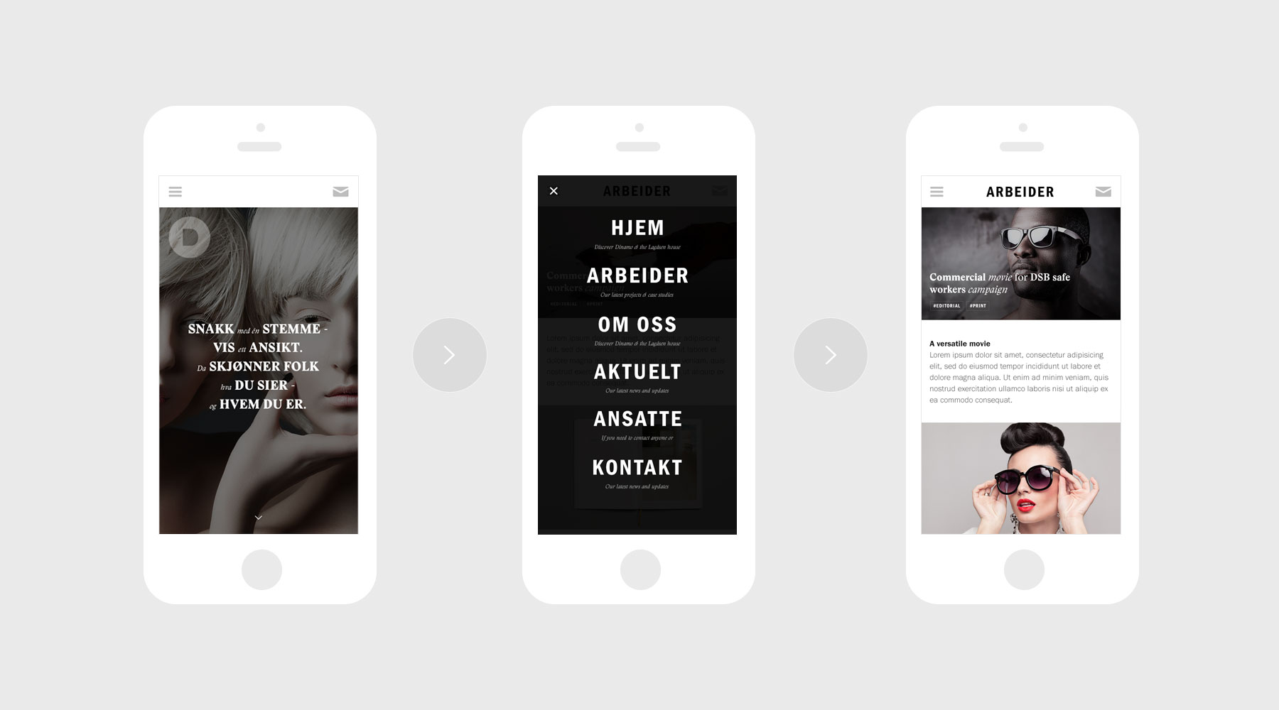
Dinamo is one of the largest, if not the largest communication house in Norway, offering a complete range of expertise, from design to public relations and advertising, content creation… My first assignment at Dinamo was to create a website showcasing the grandeur and broad horizon of the firm.
NOT REPEATING OURSELVES
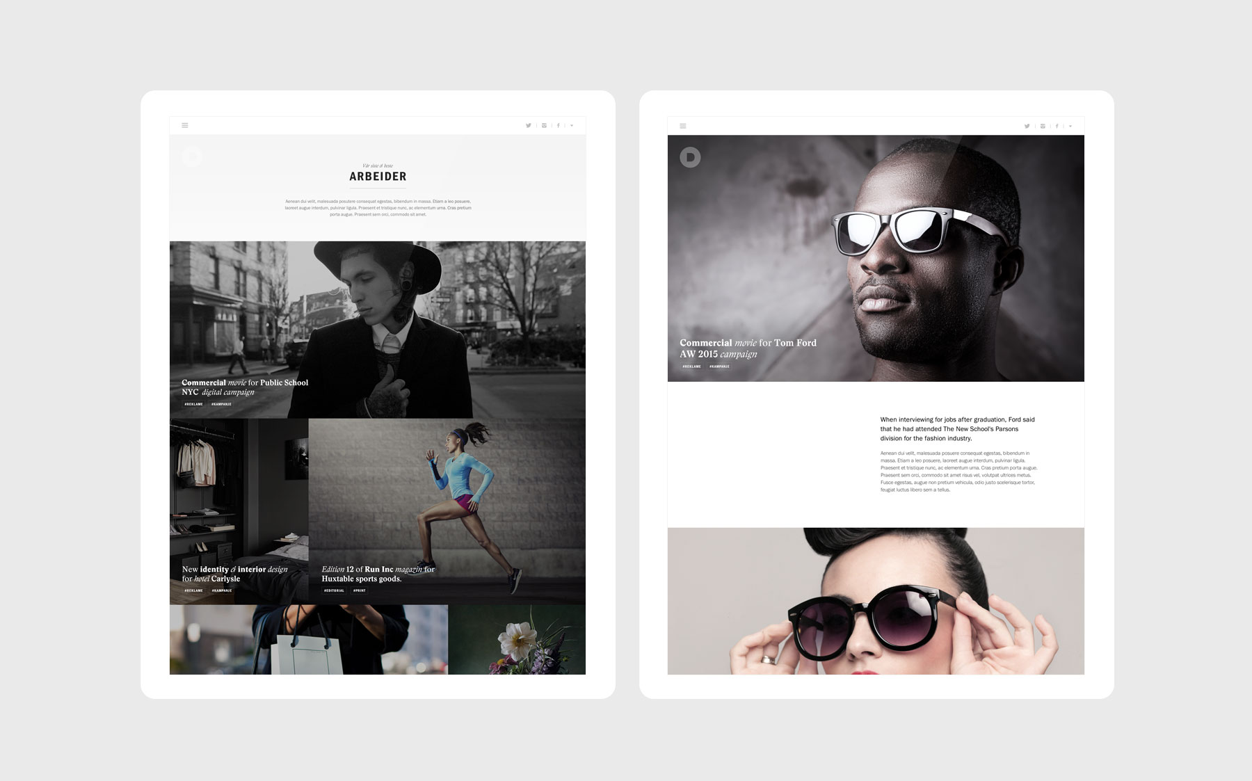
Built on the latest technologies available, the company’s online presence intends to display its versatility and richness via dynamic layouts, thoroughness of the content and easy browsing.


BEHIND THE LENS
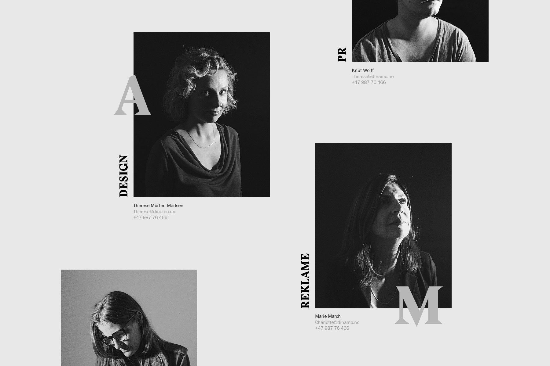
Using just an iphone and VSCO, I was also in charge of art directing and shooting every employees to display on the website. The concept for the photoshoot reflected Dinamo's varied range of competences, with the subjects looking in different directions.
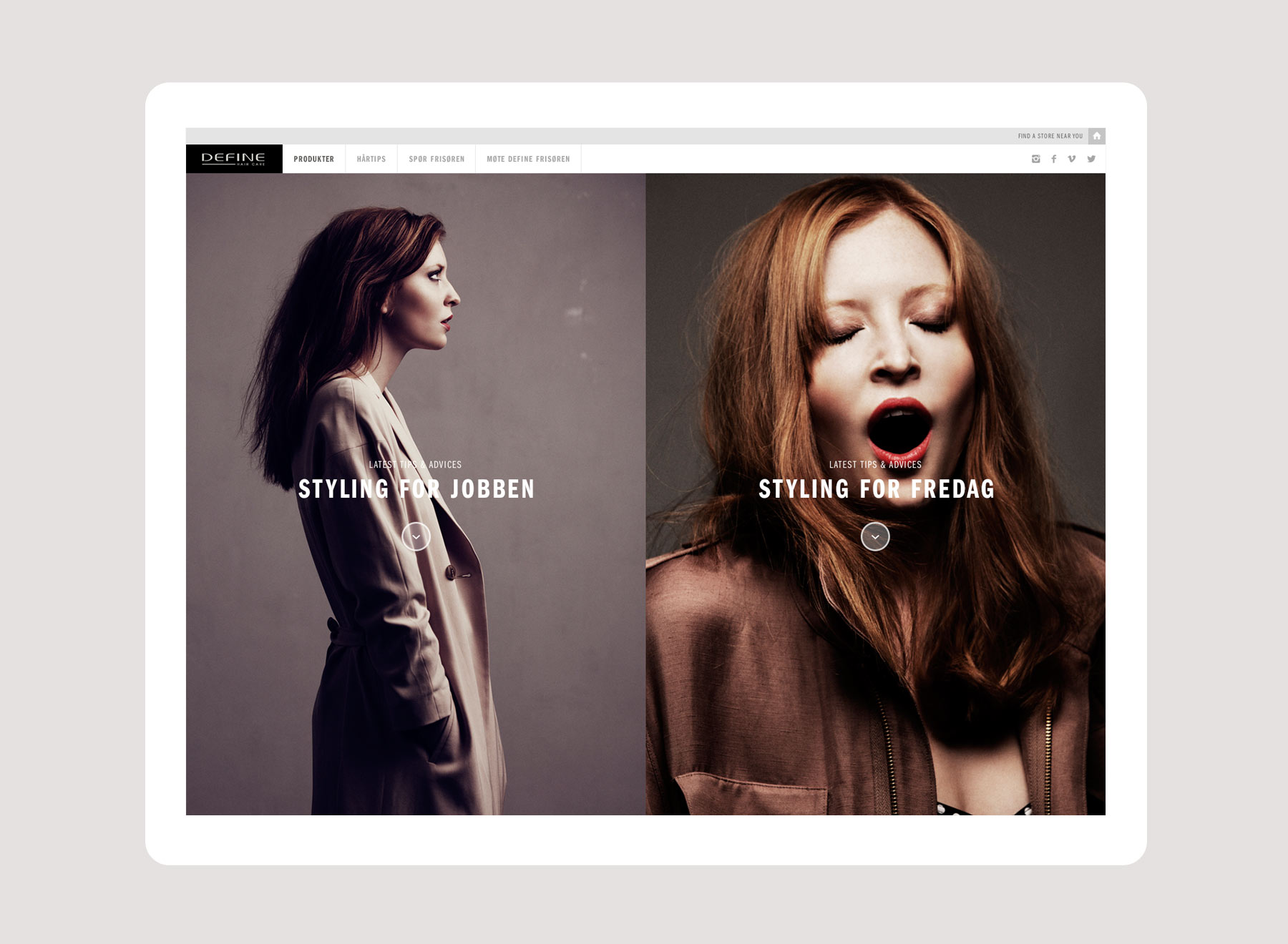
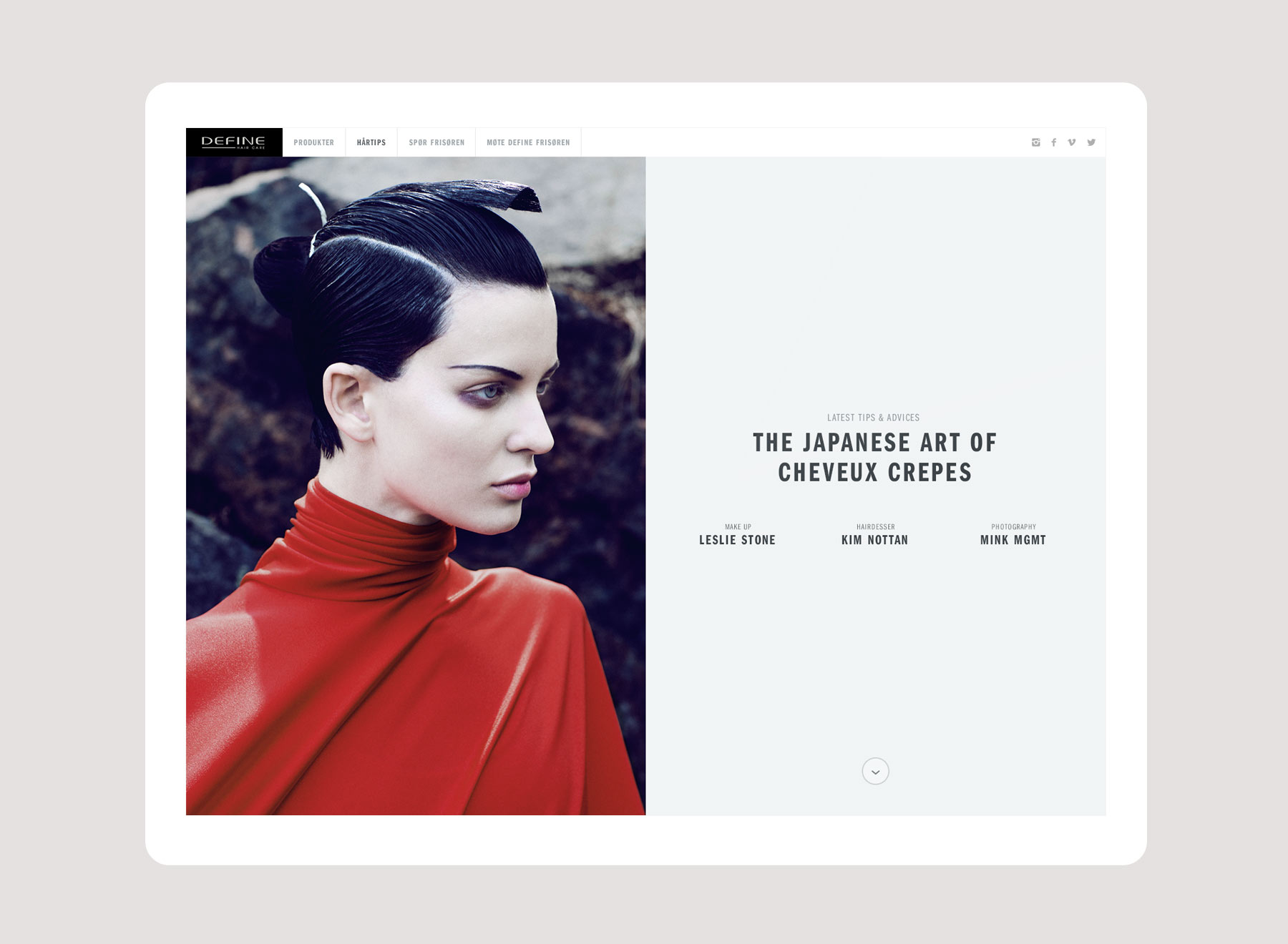
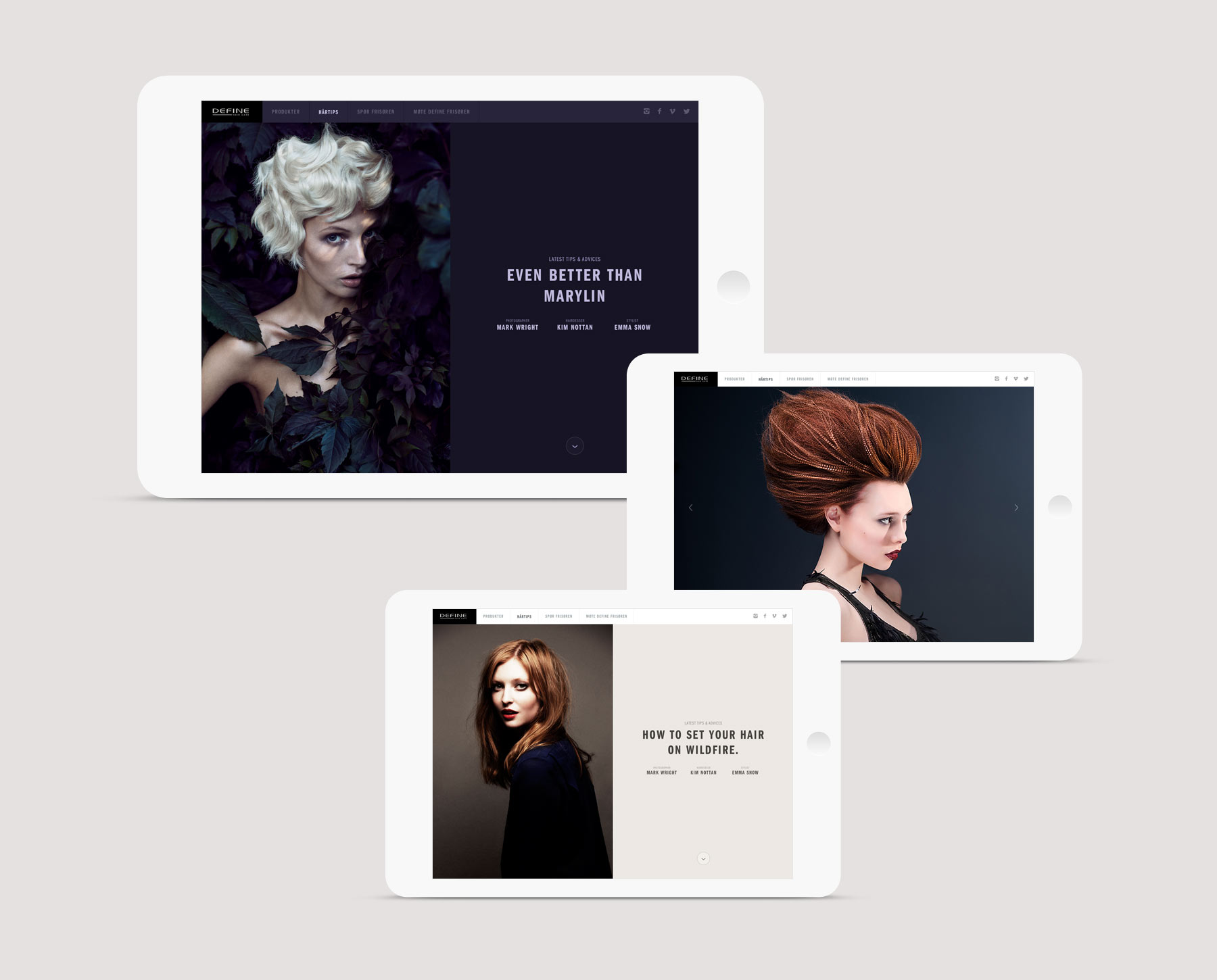
Proposal for a hair care products and advices brand. The concept is based on each and everyone’s duality. Work versus weekends, Casual friday evening at home versus fancy dinner in town. The design is based on this duality, using the principle of split layout to reinforce the idea.
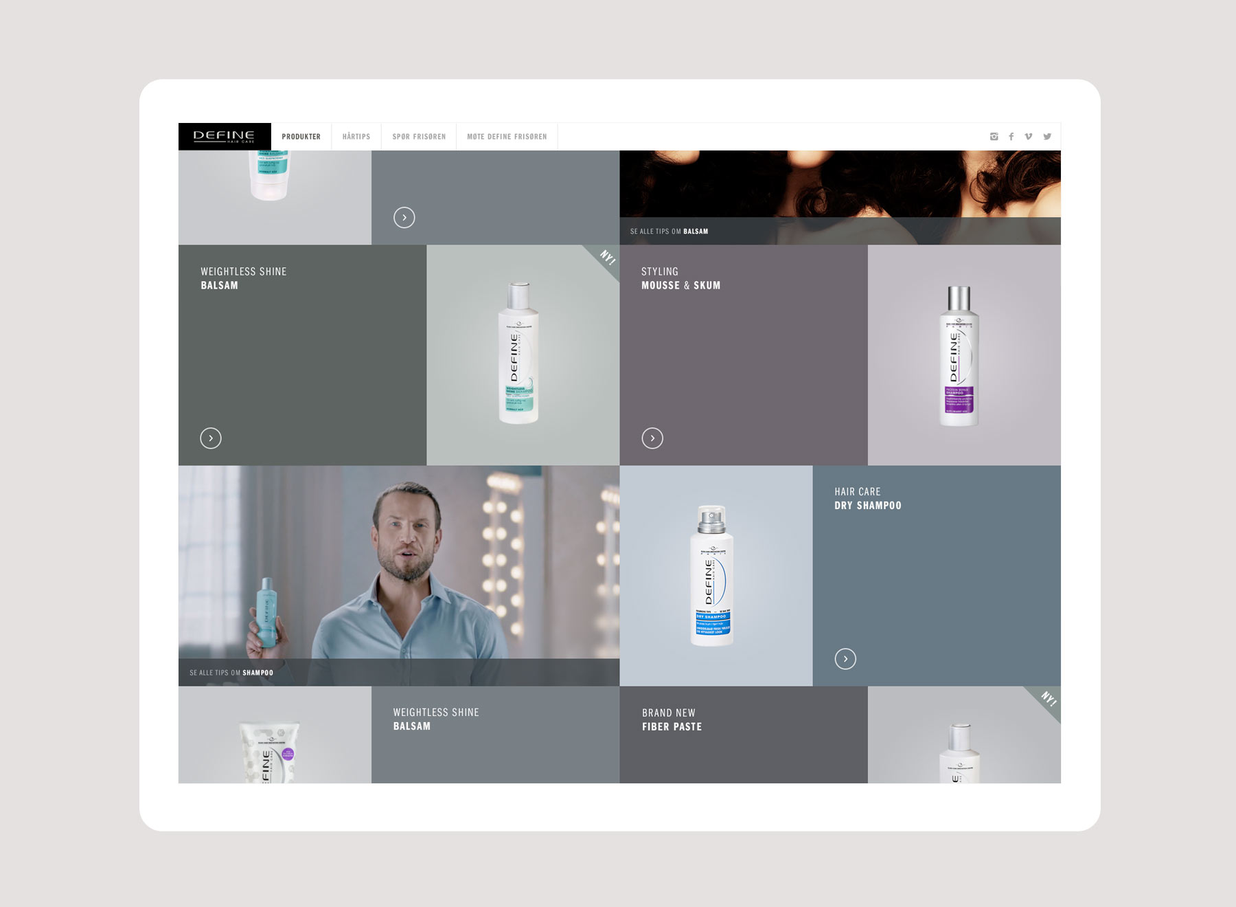
ABOUT THE CONCEPT
Everything was thought to offer a tailored experience to users. According to the day of the week, the season or the events, the website would publish relevant styling tips & stories. Editorial & Commerce are entangled to create this intangible feeling of visiting your hairdresser.
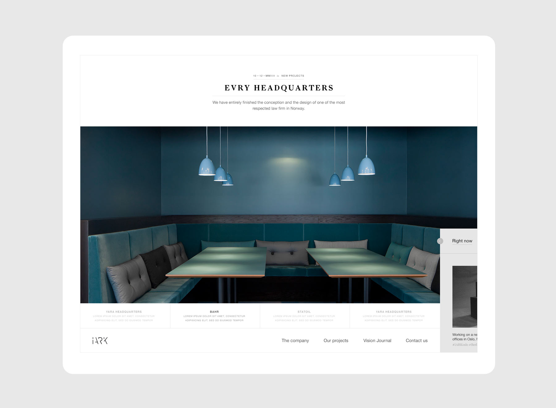
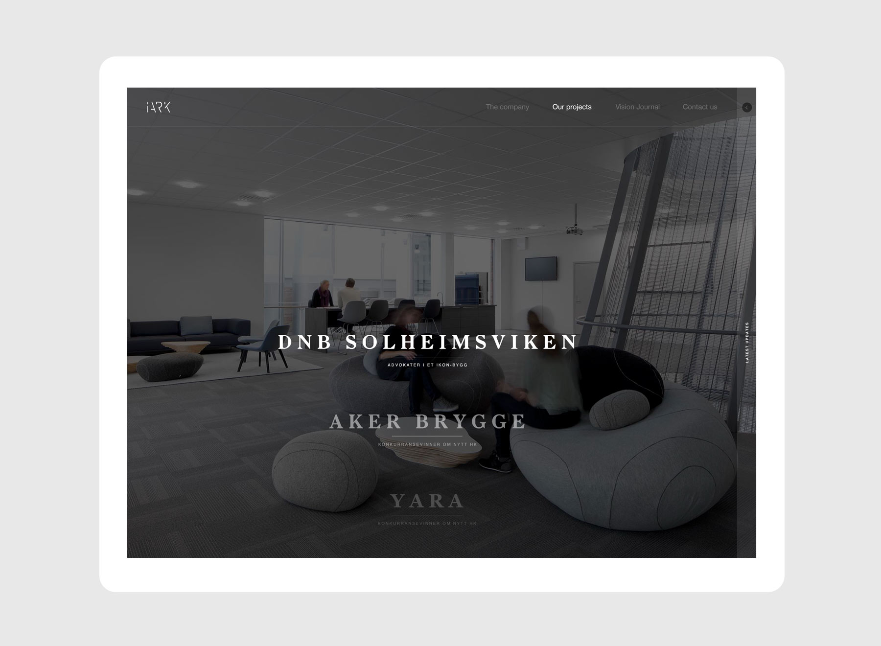
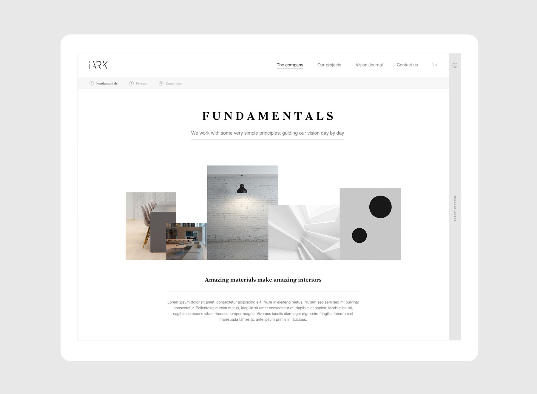
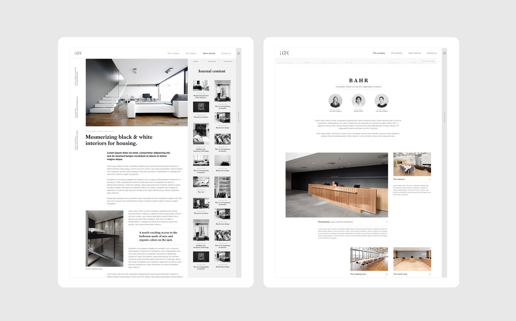
Iark's new website is an in-depth dive into the work and life of an architecture company. As Iark was recently established, but created by experienced architects, the design and experience is a pledge of their talent.
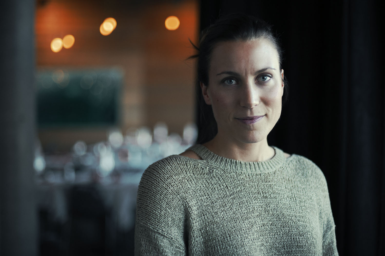
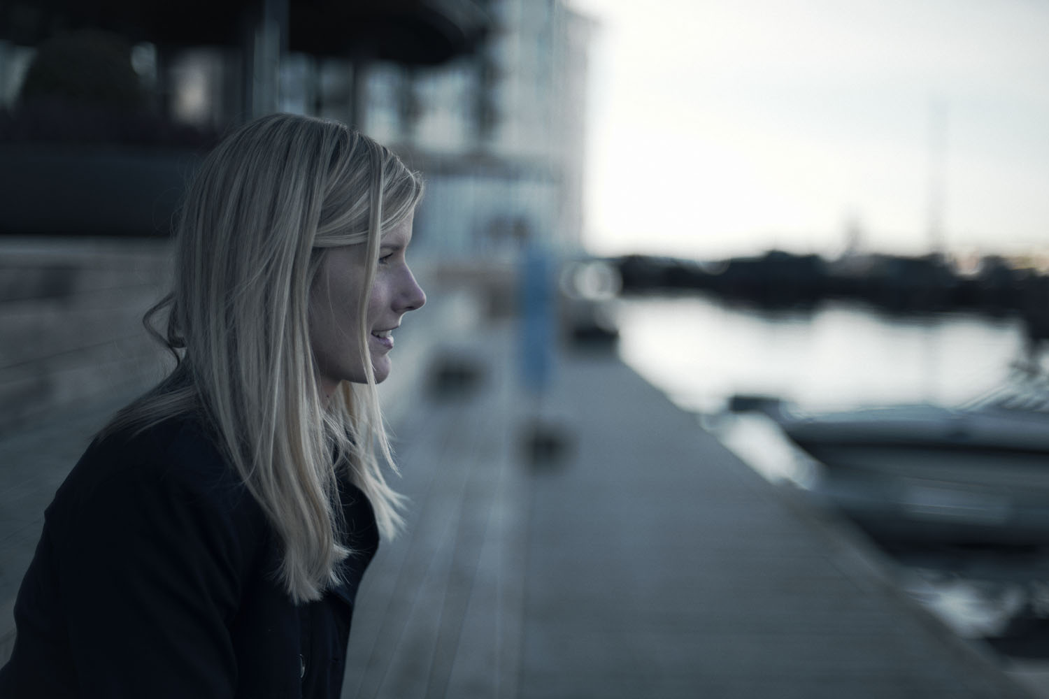
ART DIRECTION
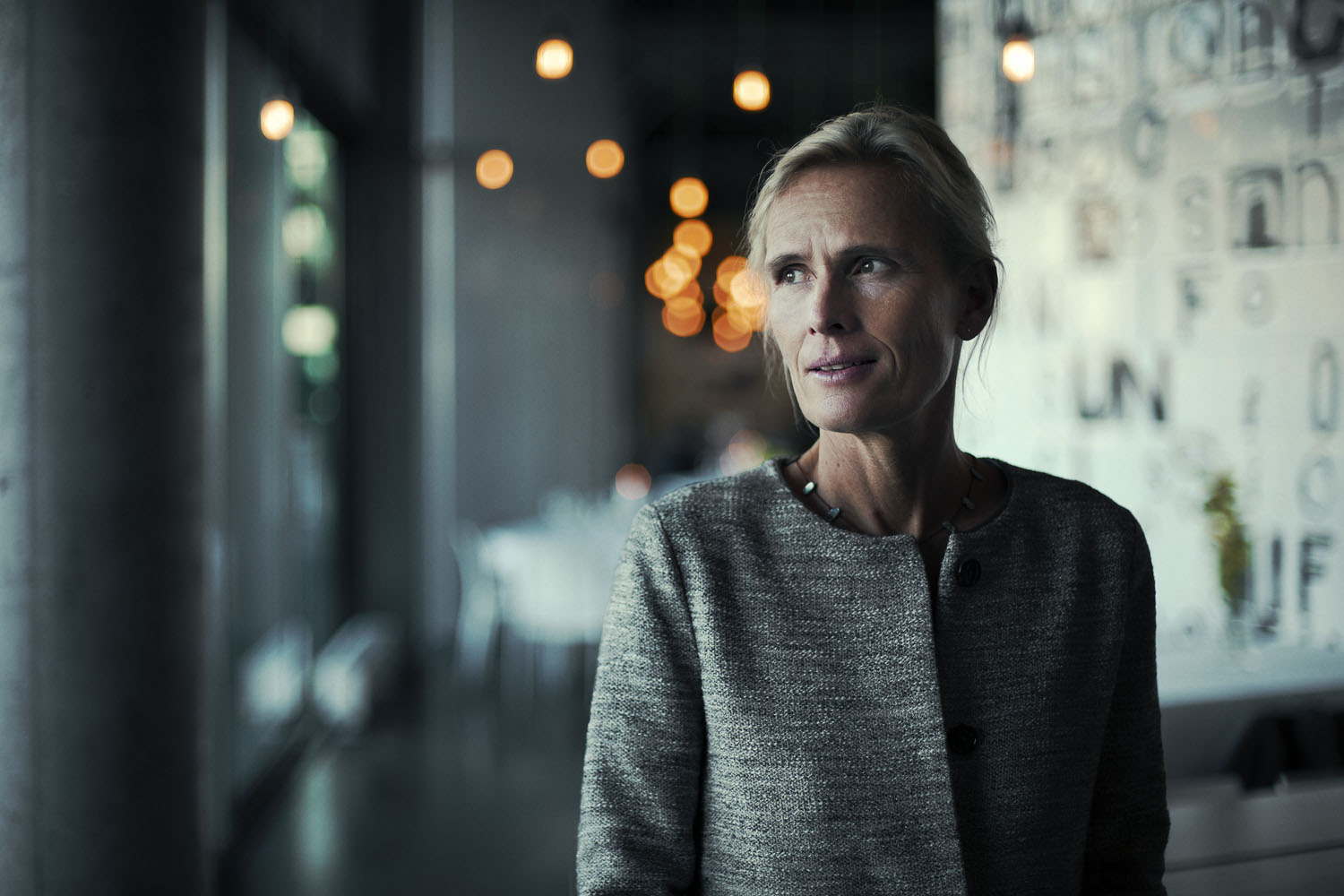
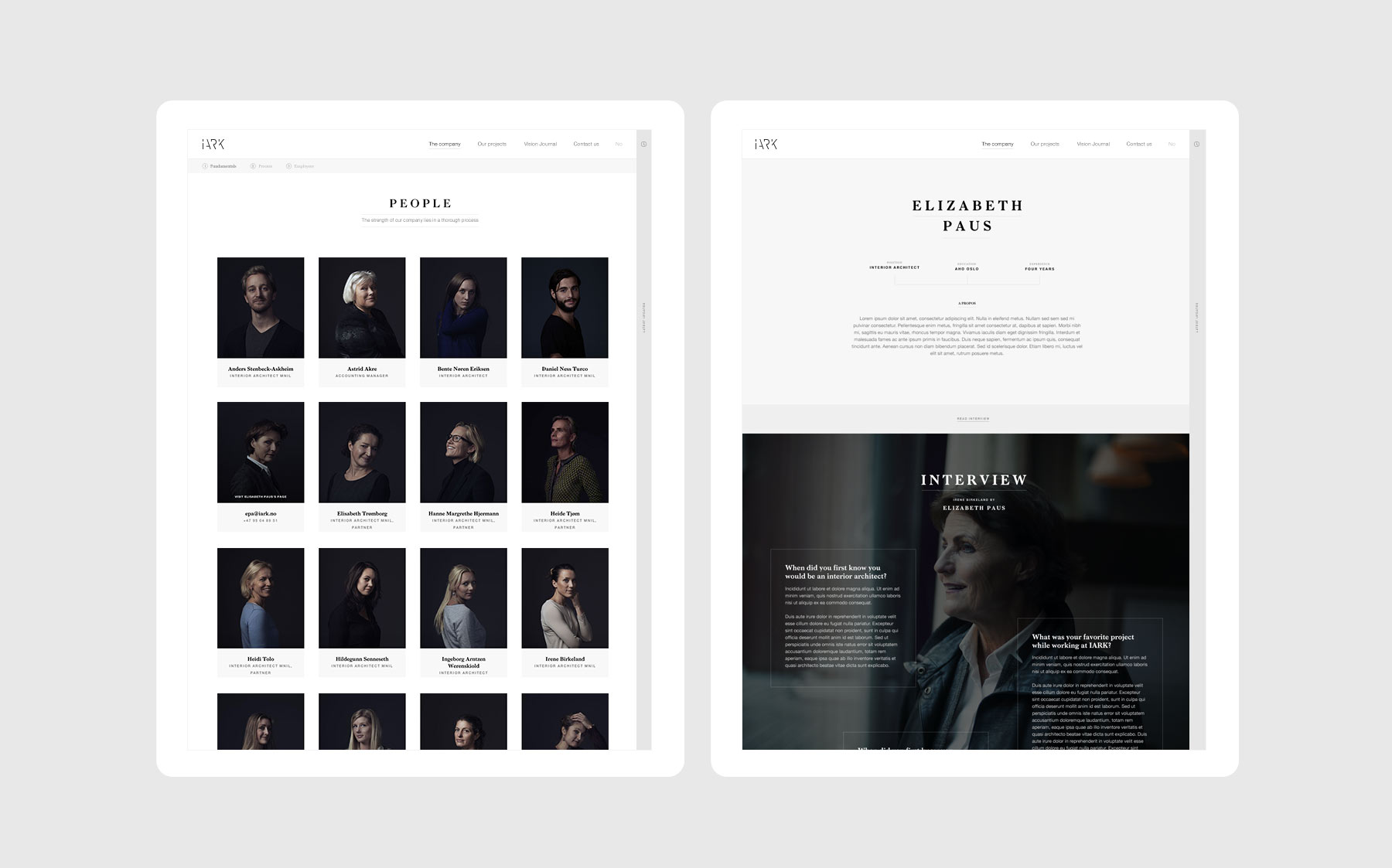
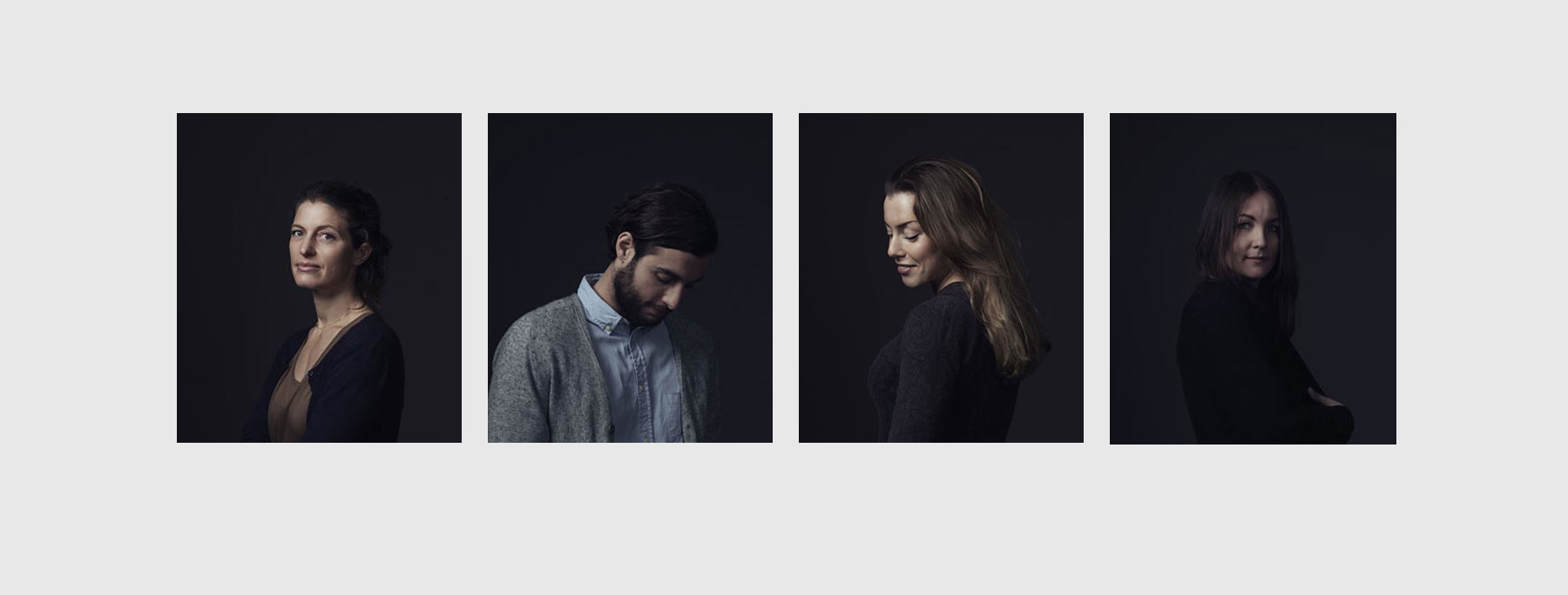
To escape the conventions of employees pictures, I was in charge of the art direction for two different shootings. The concept lied within the fact that Iark delivers brilliant work because it's composed of brilliant minds. I wanted to show the people behind the works. I wanted to personify Iark. Photography by Kai Myhre
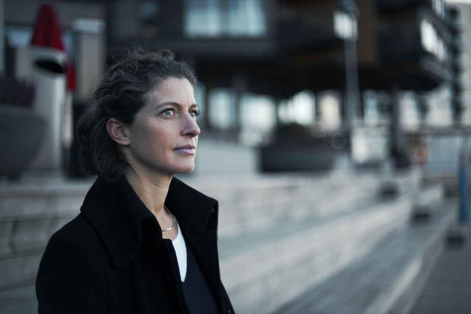
INVITING LAYOUTS
The different page layouts were designed with a simple idea in mind: Be an invitation to discover more about the firm. Read through the vision journal, discover projects via a modular layout making each page unique, or discover employees with entertaining interviews. Such a website should not only be interesting, but also exciting to browse.
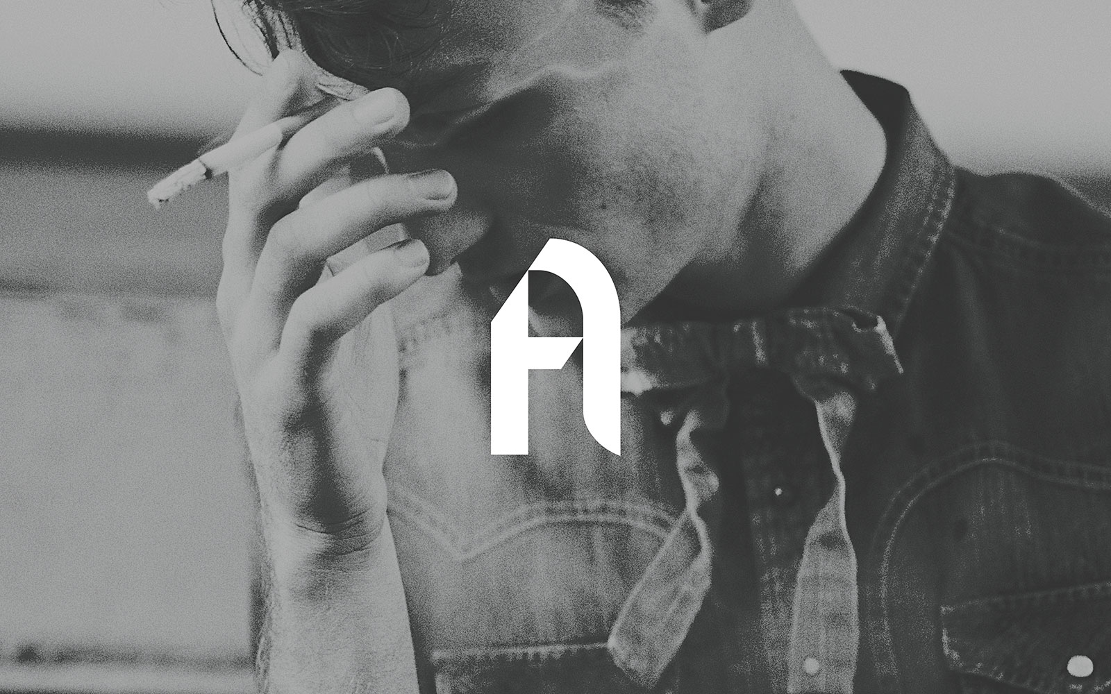
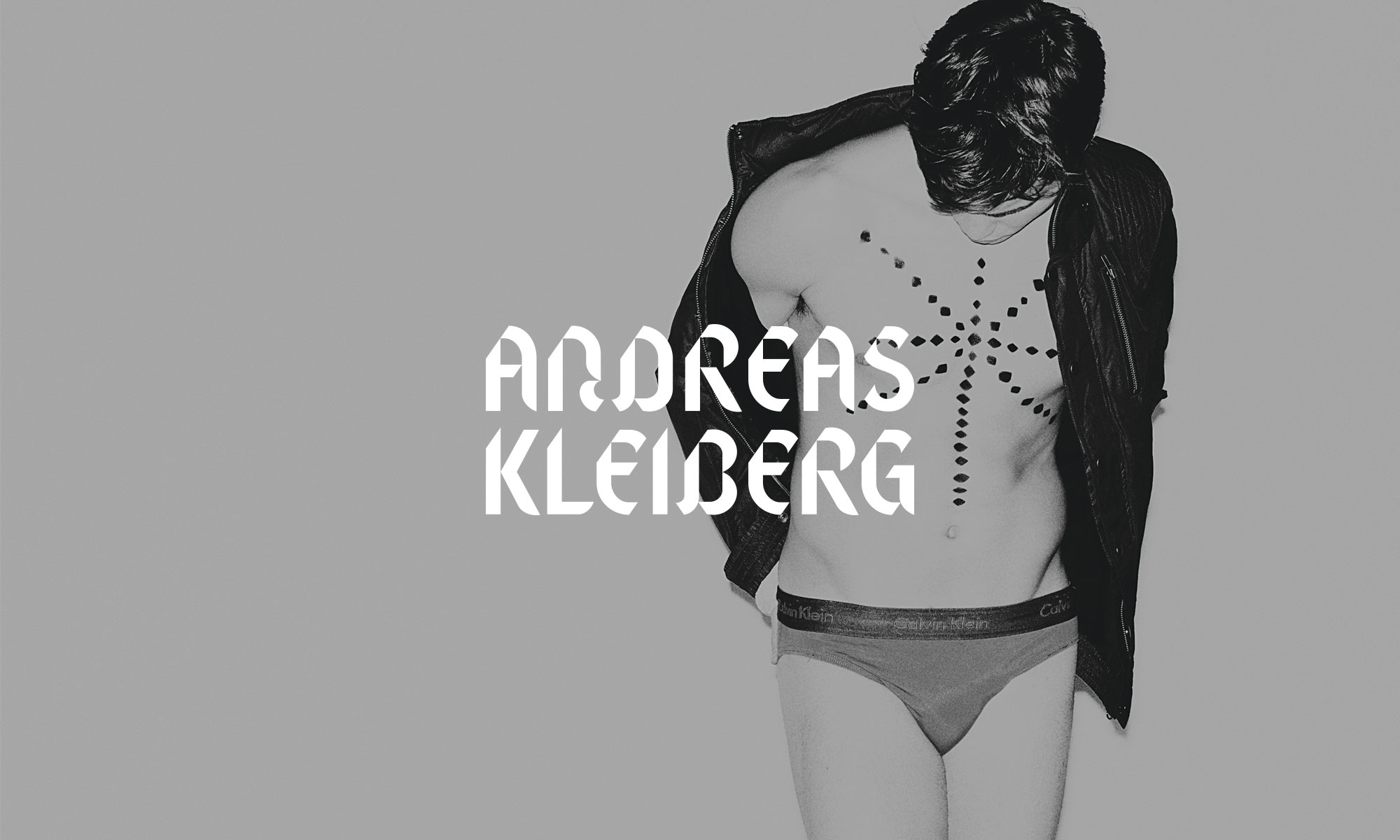
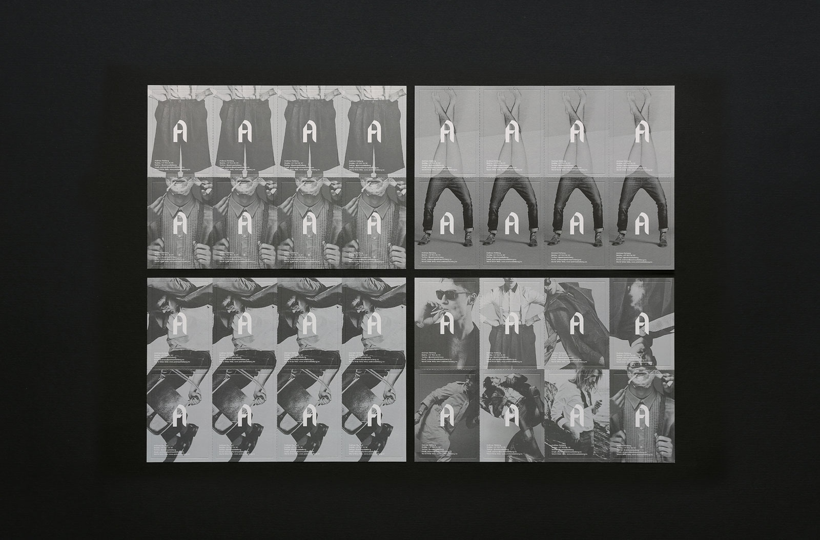
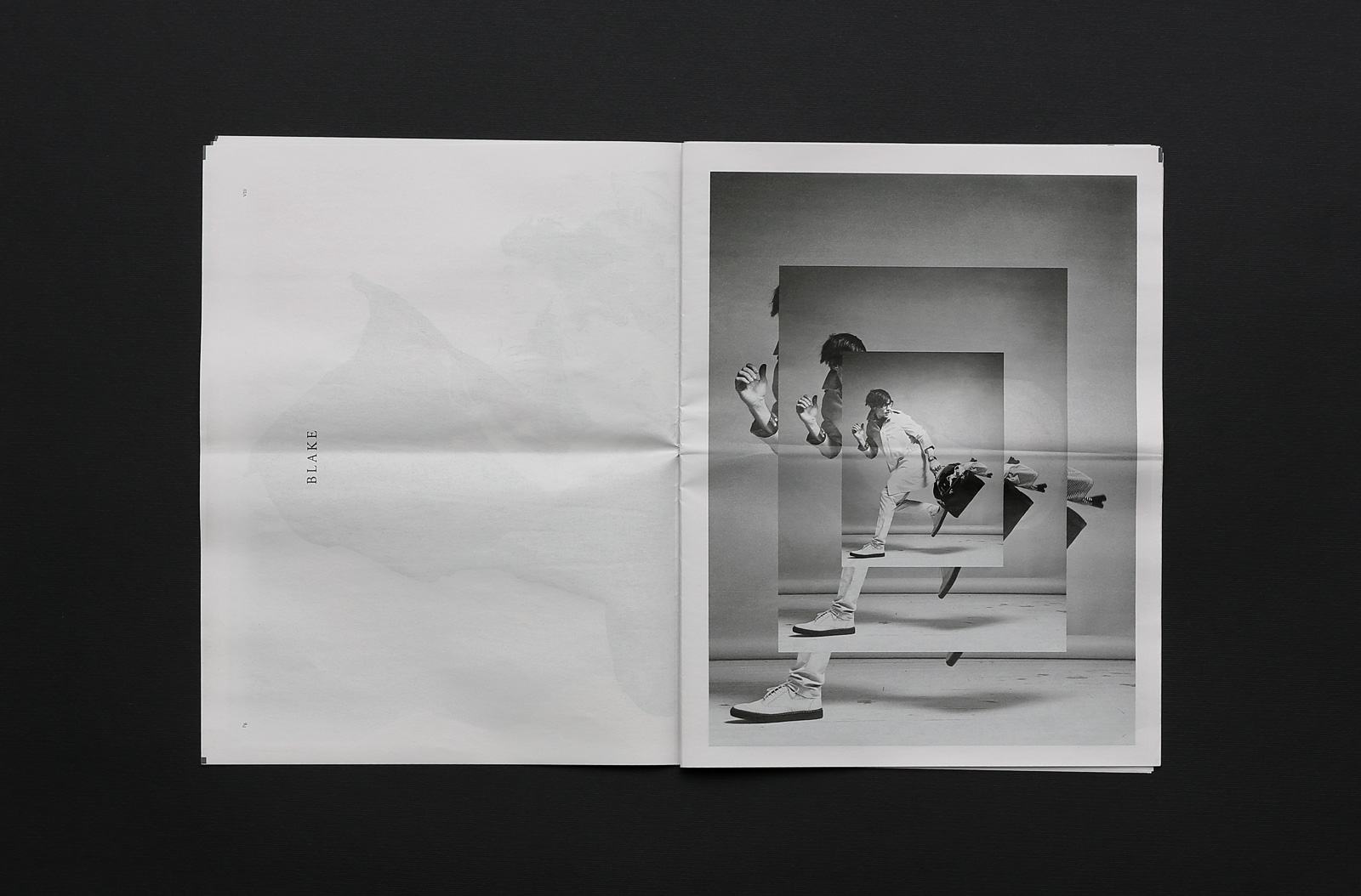
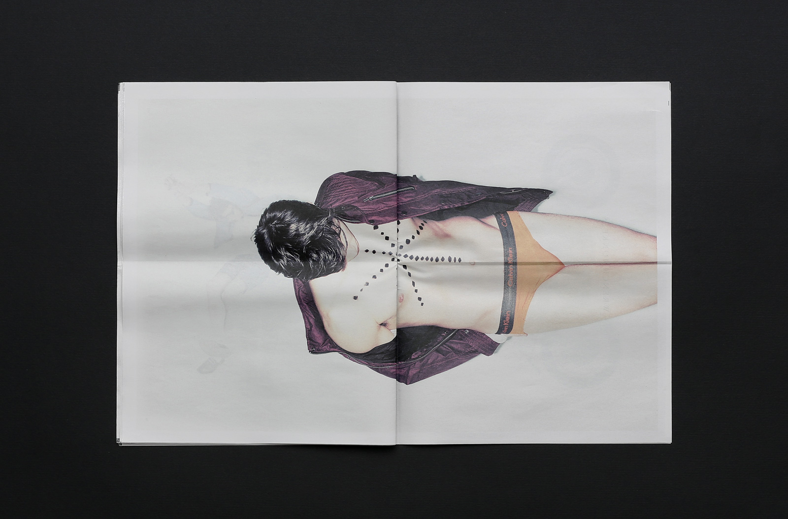
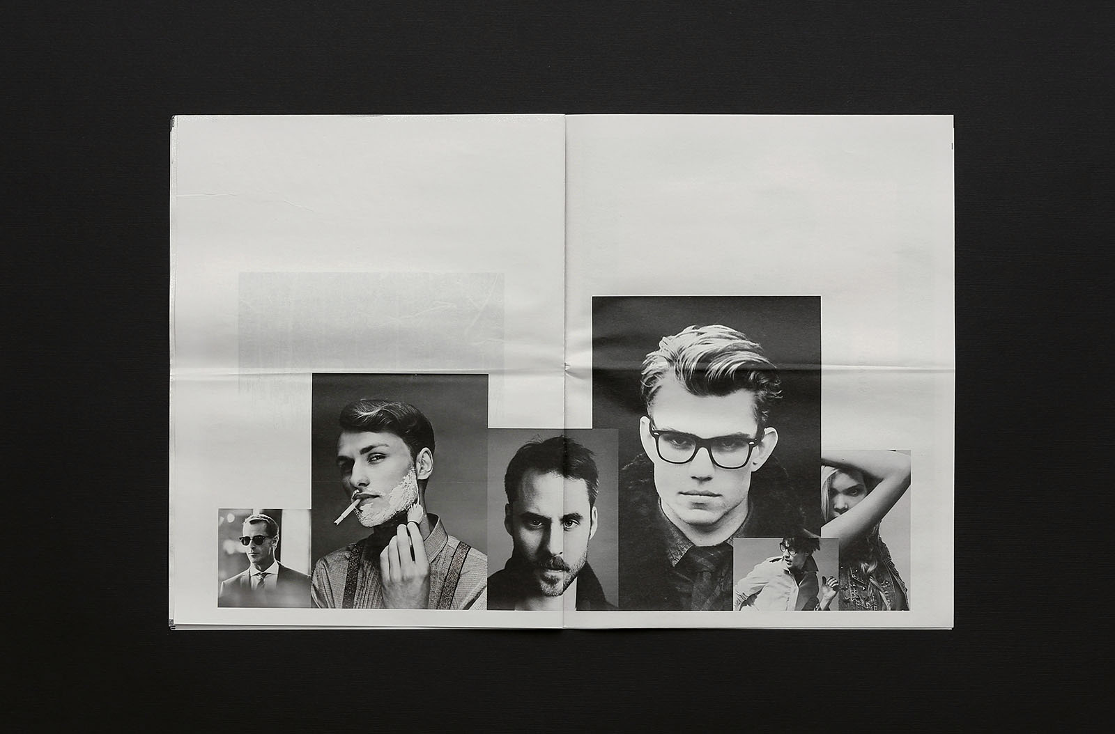
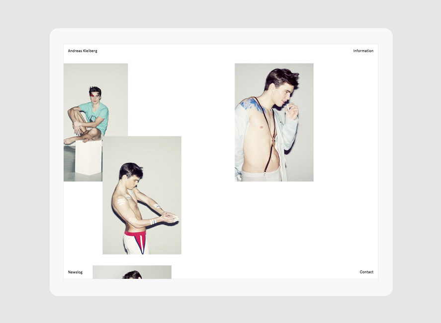
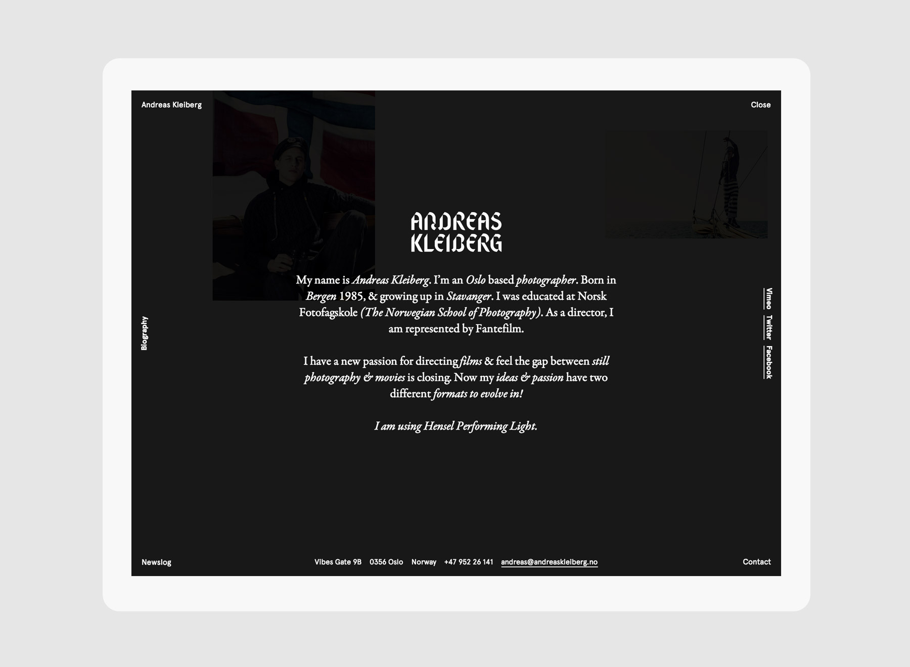
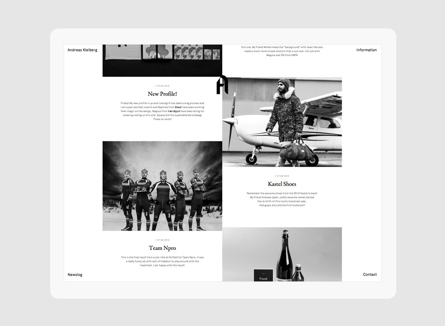
An unorthodox approach for a photographer's communication, influenced by his choice of focusing on male fashion photography. Out of format business cards, spray painted limited edition newspaper, everything was thought for Andreas to stand out & intrigue new clients.
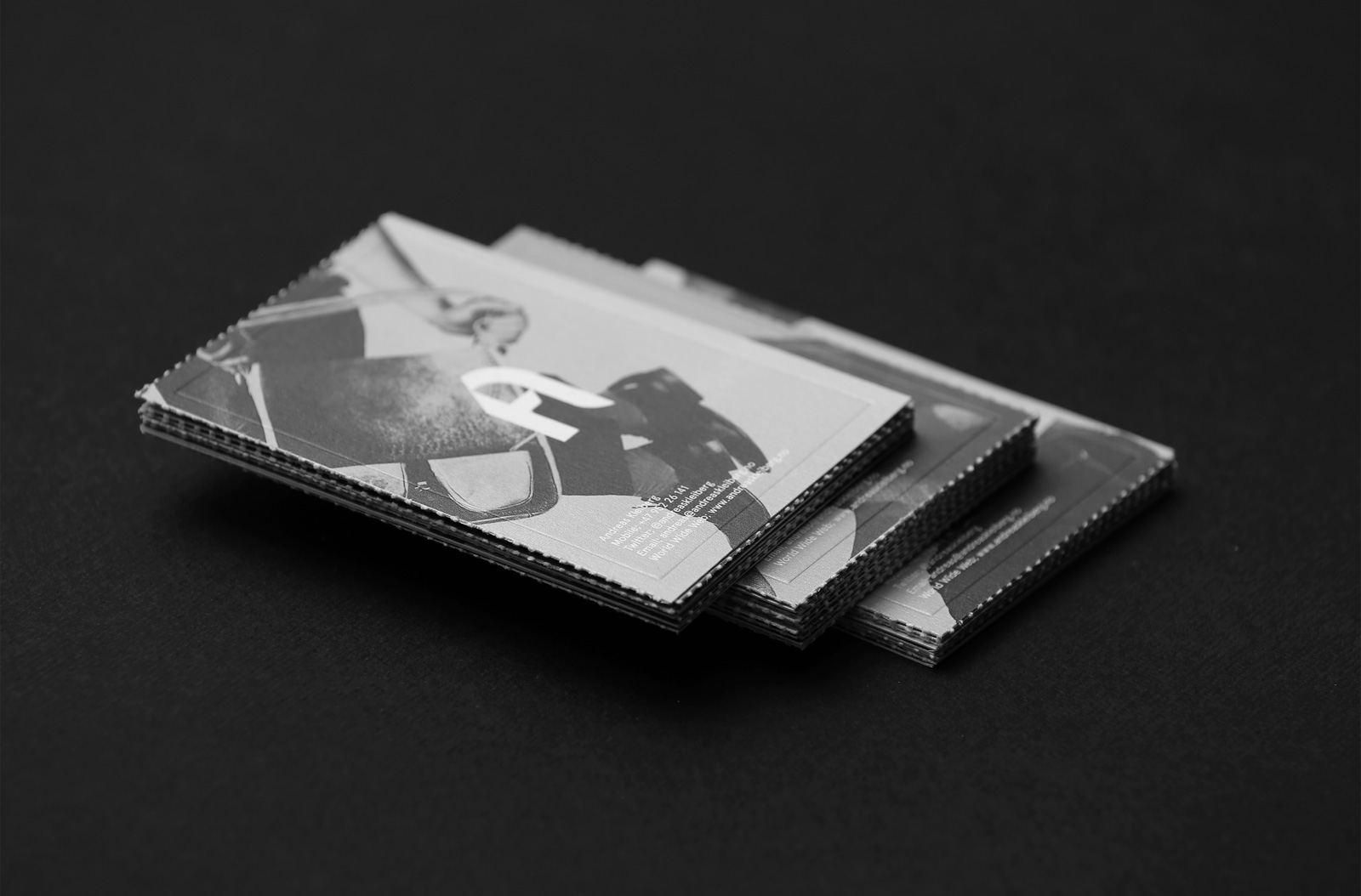
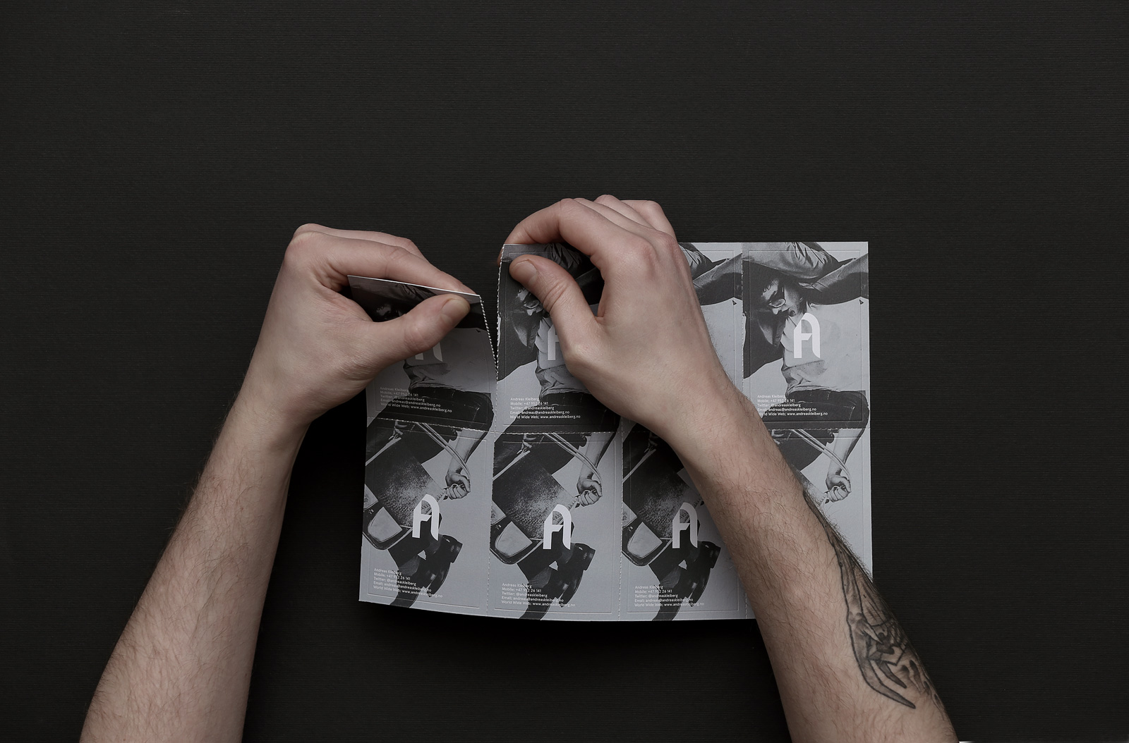
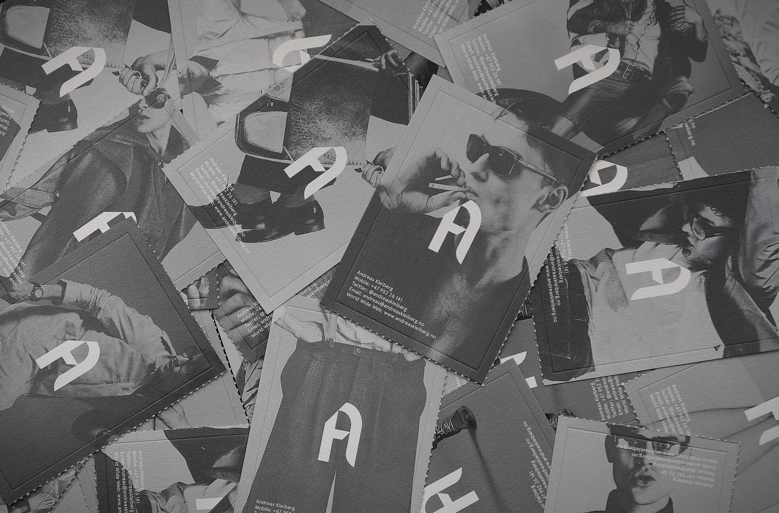
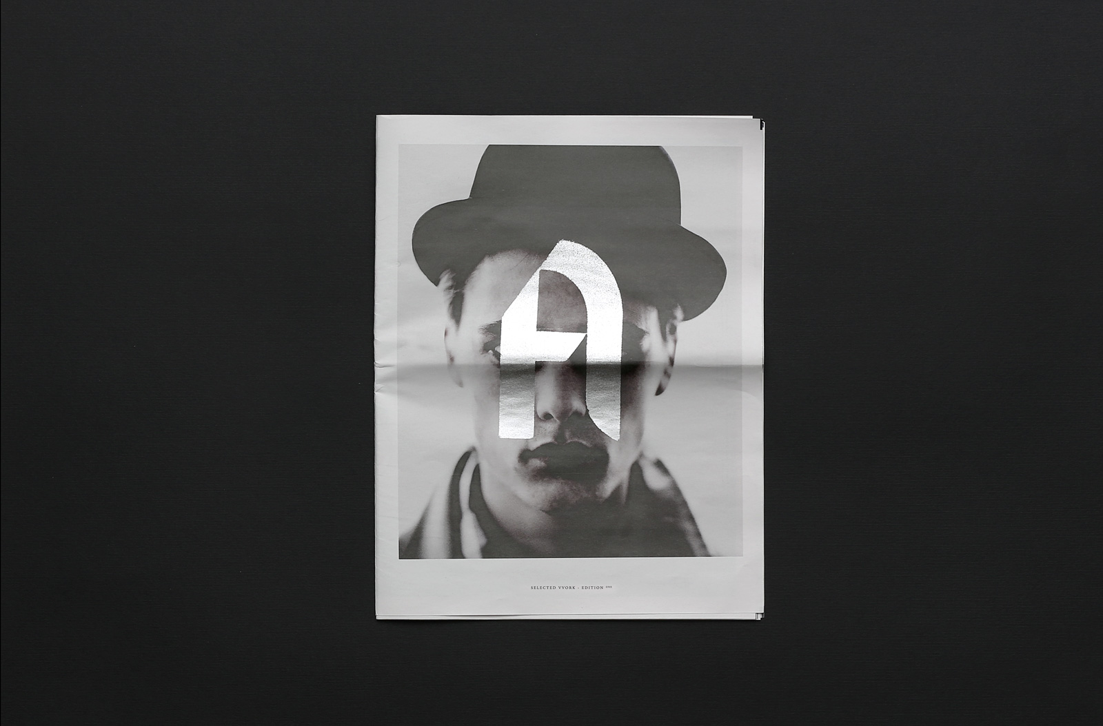
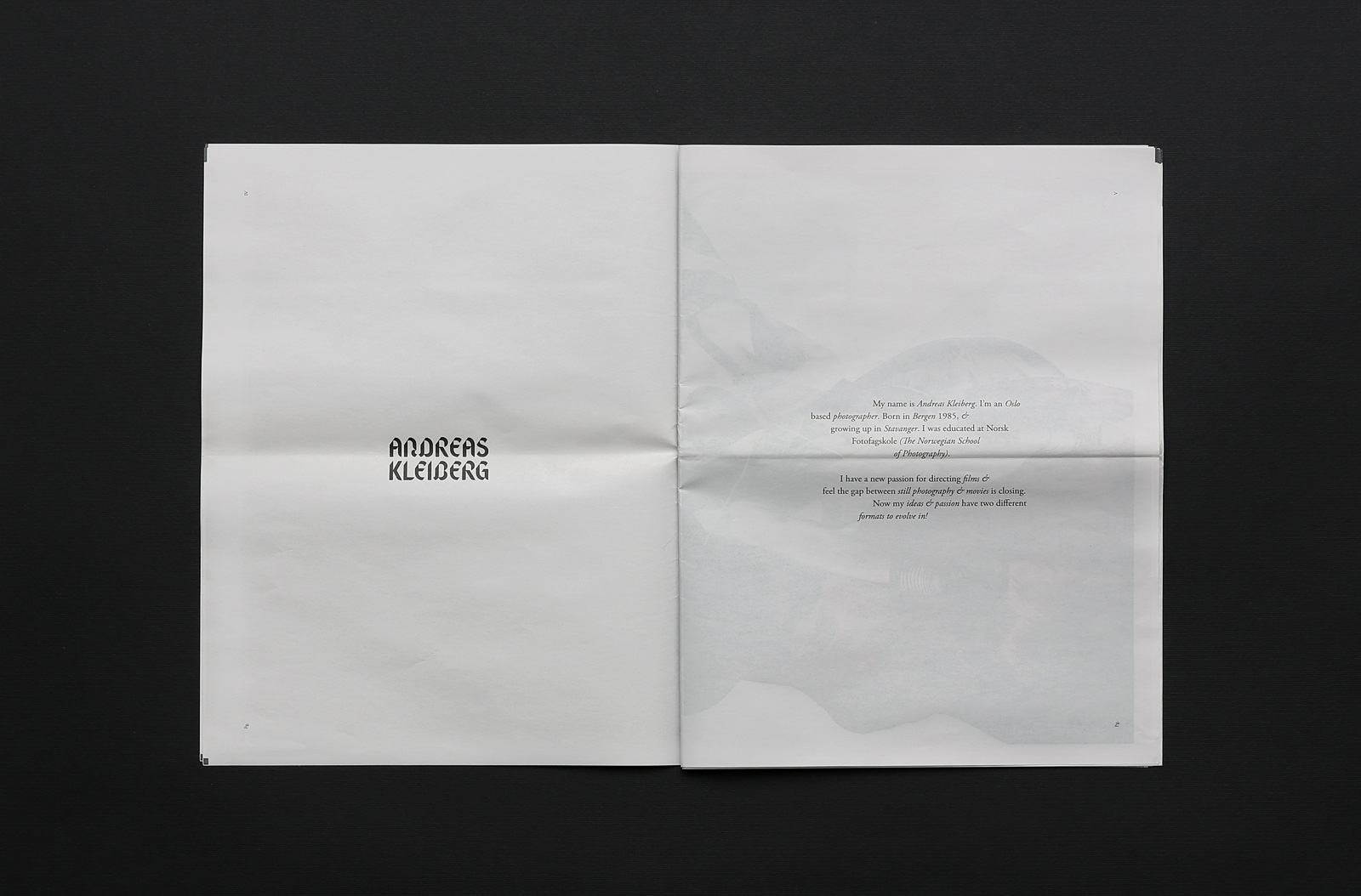
"Andreas Kleiberg rolls away from clichés"ETAPES MAGAZINE — FRANCE
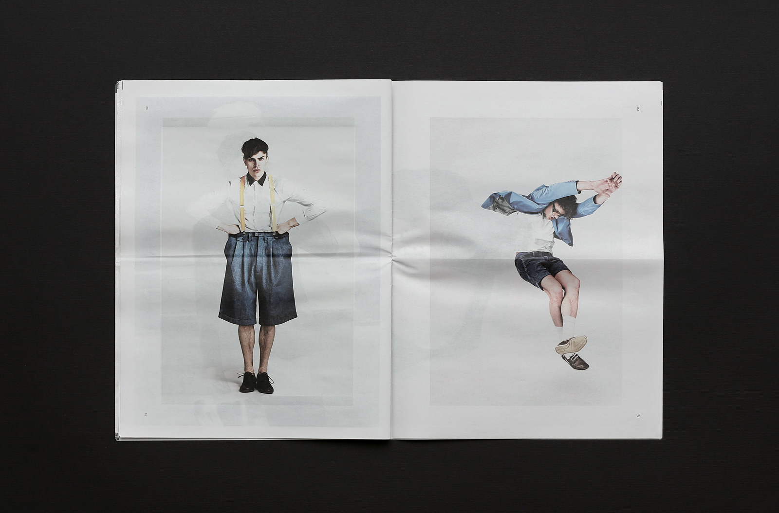
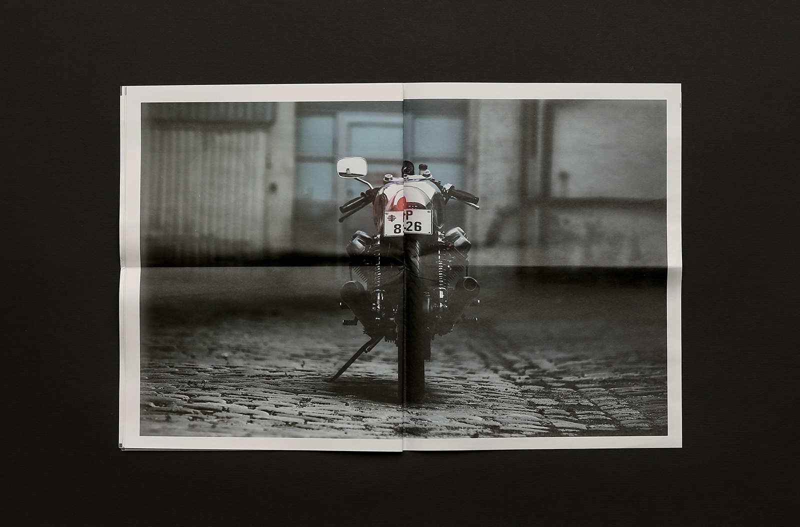
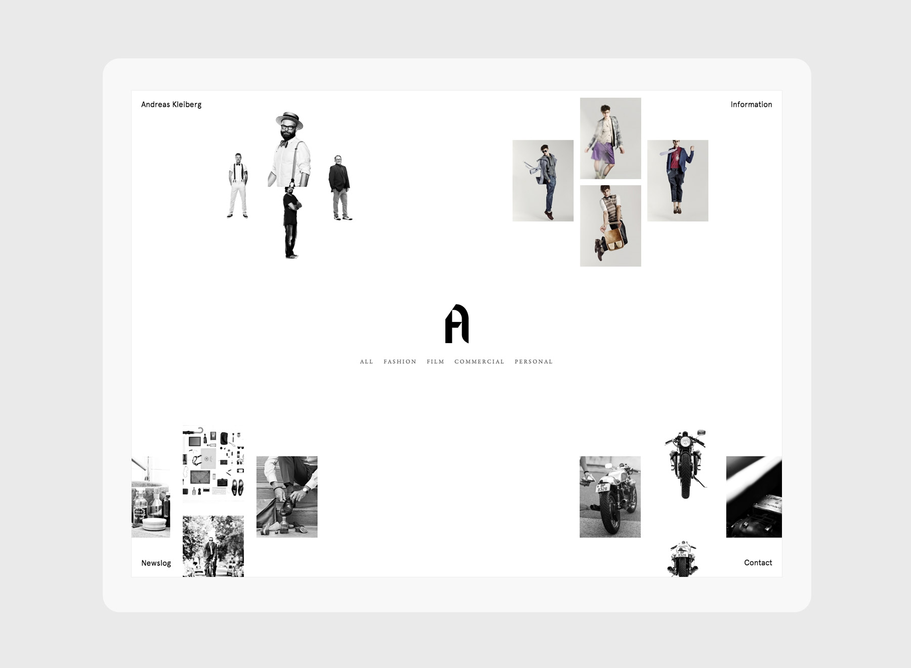
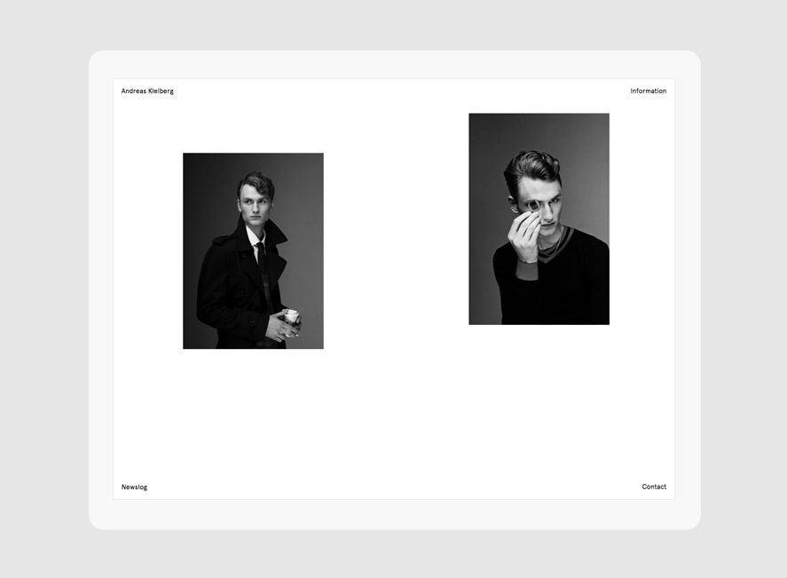
A FEW WORDS ABOUT ME
I'm an Oslo based designer with over 8 years of experience in the digital industry. Always combining form with function, my practice finds its ground in simplicity. I work from the core of user experience to the latest visual details, all of which would be impossible without solid processes & enthusiastic team work. I am, in addition, the proud recipient of several professional awards and nominations.
USER EXPERIENCE
I firmly believe user experience is unseparable from the visual aspect of a digital product. With a solid foundation of research led by a thorough process, interactive solutions can often solve the most demanding issues.
VISUAL DESIGN
No detail is small enough to be omitted. I'm a detail driven designer believing in iteration and constant refinement. I usually work in a clean and minimalist visual style, offering modern solutions to complex problems.
AWARDS & RECOGNITION
2016
Honourable mention | Awwwards | Portfolio
2015
IxDA Award | NRK TV
Finalist | European Design Awards | NRK TV
Award for Design Excellence | Norwegian Design Council | NRK TV
Honour Award Nomination | Norwegian Design Council | NRK TV
Diploma | Service Design | Visuelt | NRK TV
2014
Diploma | Interactive Design | Visuelt | Andreas Kleiberg
2013
YCN Professional award | YCN Network London
Silver | Promotional website | EDA | Andreas Kleiberg
Diploma | Interactive Design | Visuelt | Storm Studios
SOTD | Awwwards | Andreas Kleiberg
2012
Gold | Interactive Design | Visuelt | Helen & Hard
GET IN TOUCH